
Role:
SOLE DESIGNER - Concept Creation & Graphic Design
Timeline:
April-May 2023 (1 month)
Programs:
✽ Chat GPT
✽ Adobe Illustrator
✽ Adobe After Effects
✽ Adobe InDesign
Deliverables:
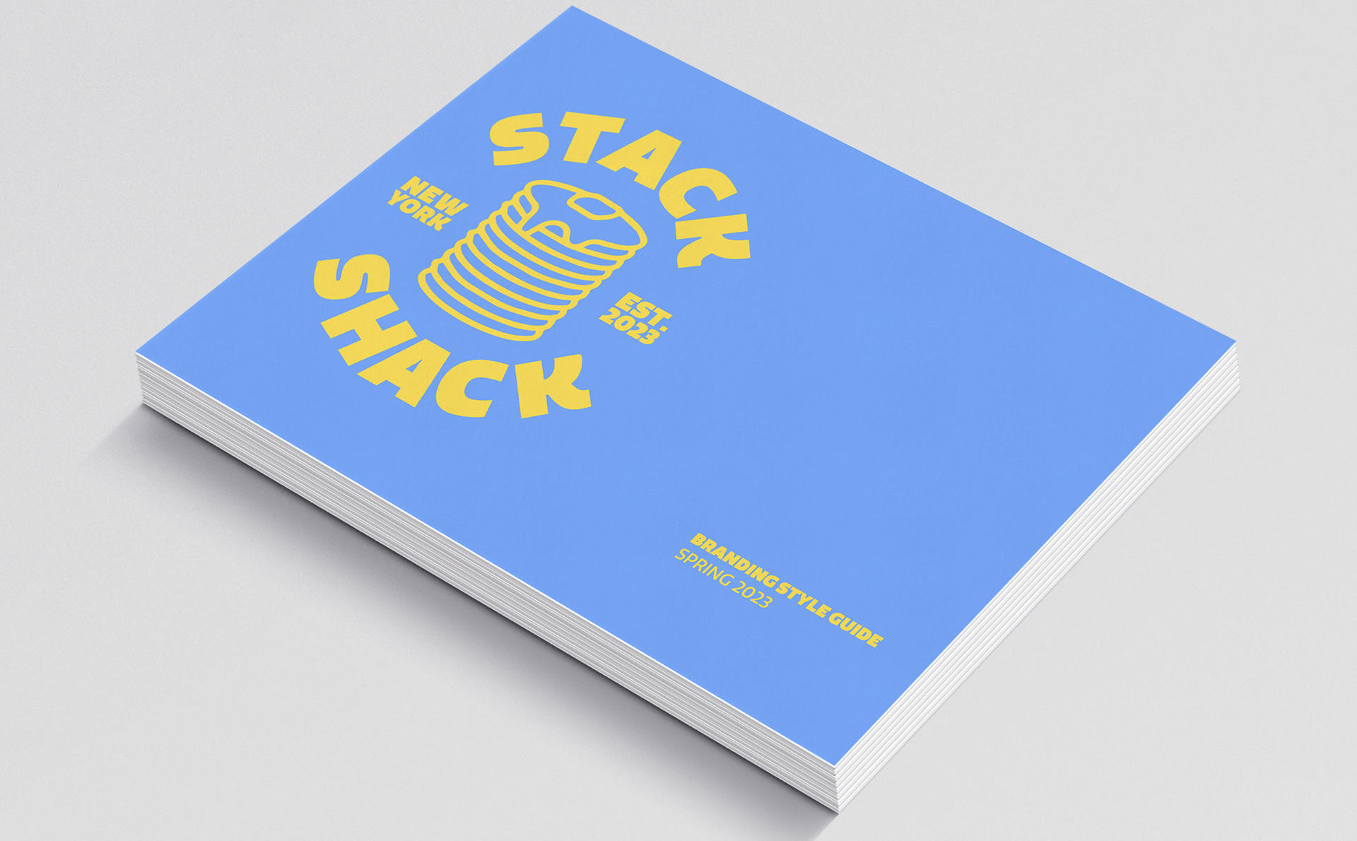
✽ Branding Style Guide
✽ Digital Menu
✽ Social Media Graphics
Overview:
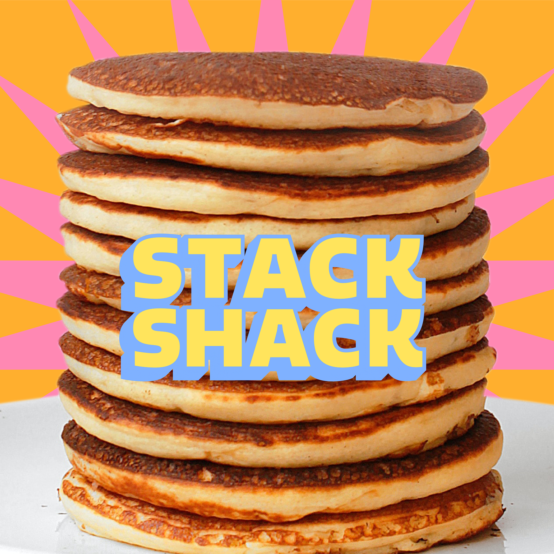
Stack Shack is a fast food pancake restaurant targeted at young pancake fanatics who are looking to get some some unique pancakes at any hour of the day. With a multitude of customizable pancake options and a unique set of signature creations, Stack Shack is more than a fast food franchise; it’s a place for people to express themselves through good food and make some memories. I fully developed the brand identity, translated that into a formal style guide, and used these values to design a menu and social media graphics.

PROCESS
PHASE I: CONCEPT
IDeation
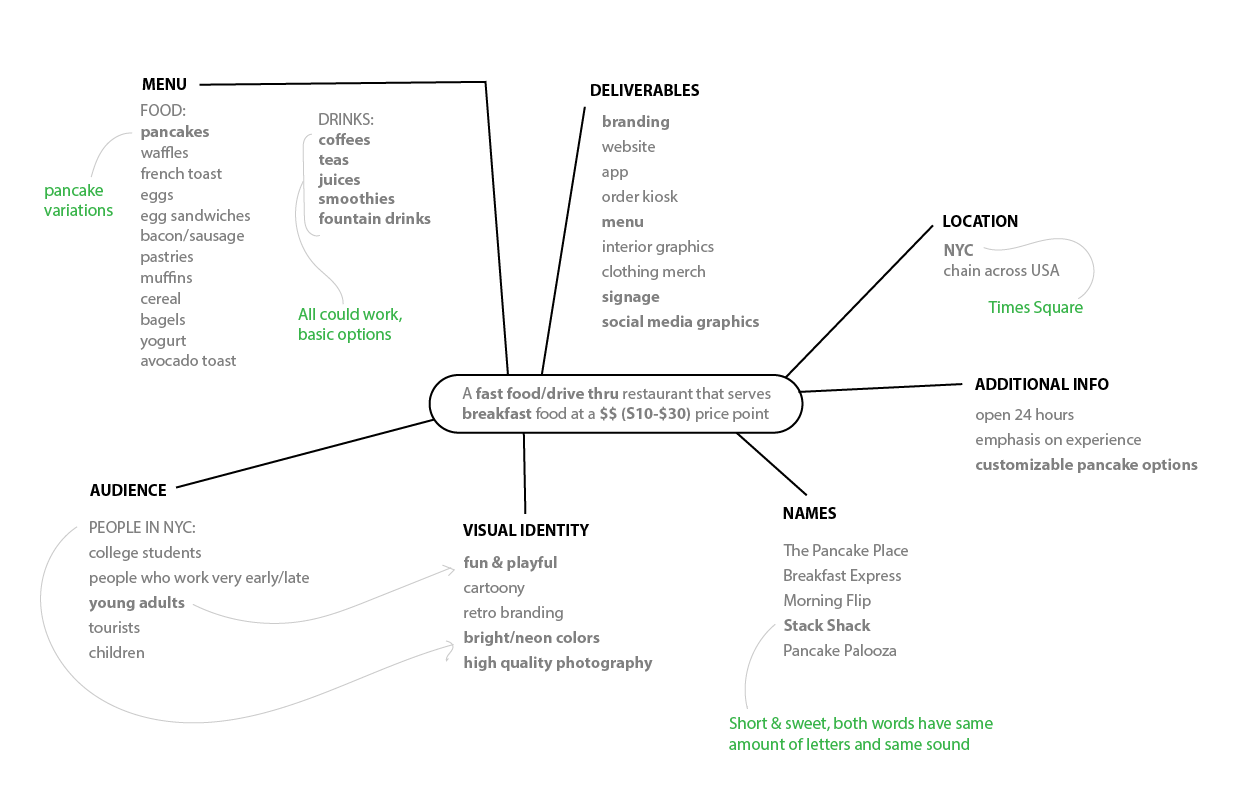
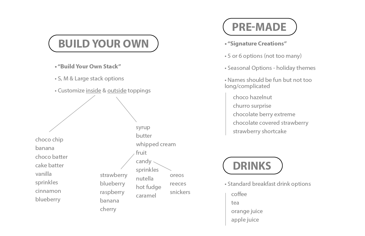
This entire project began with the prompt; "A fast food/drive thru restaurant that serves breakfast food at a $$ (S10-$30) price point." From there, this mind map was created to work through some potential ideas.
✽ To help brainstorm some ideas for a name, I turned to Chat GPT. Although I am not entirely happy with the idea of using AI in the design world, I find it can be a useful tool to help inspire further ideation. Chat GPT did not explicitly suggest "Stack Shack", but it did help me arrive at a name sooner.
Audience
Young Adults in NYC
goals
✽ Design entirely unique restaurant
✽ Attract attention using fun branding
✽ Encourage creativity
✽ Create memorable experience
phase ii: branding
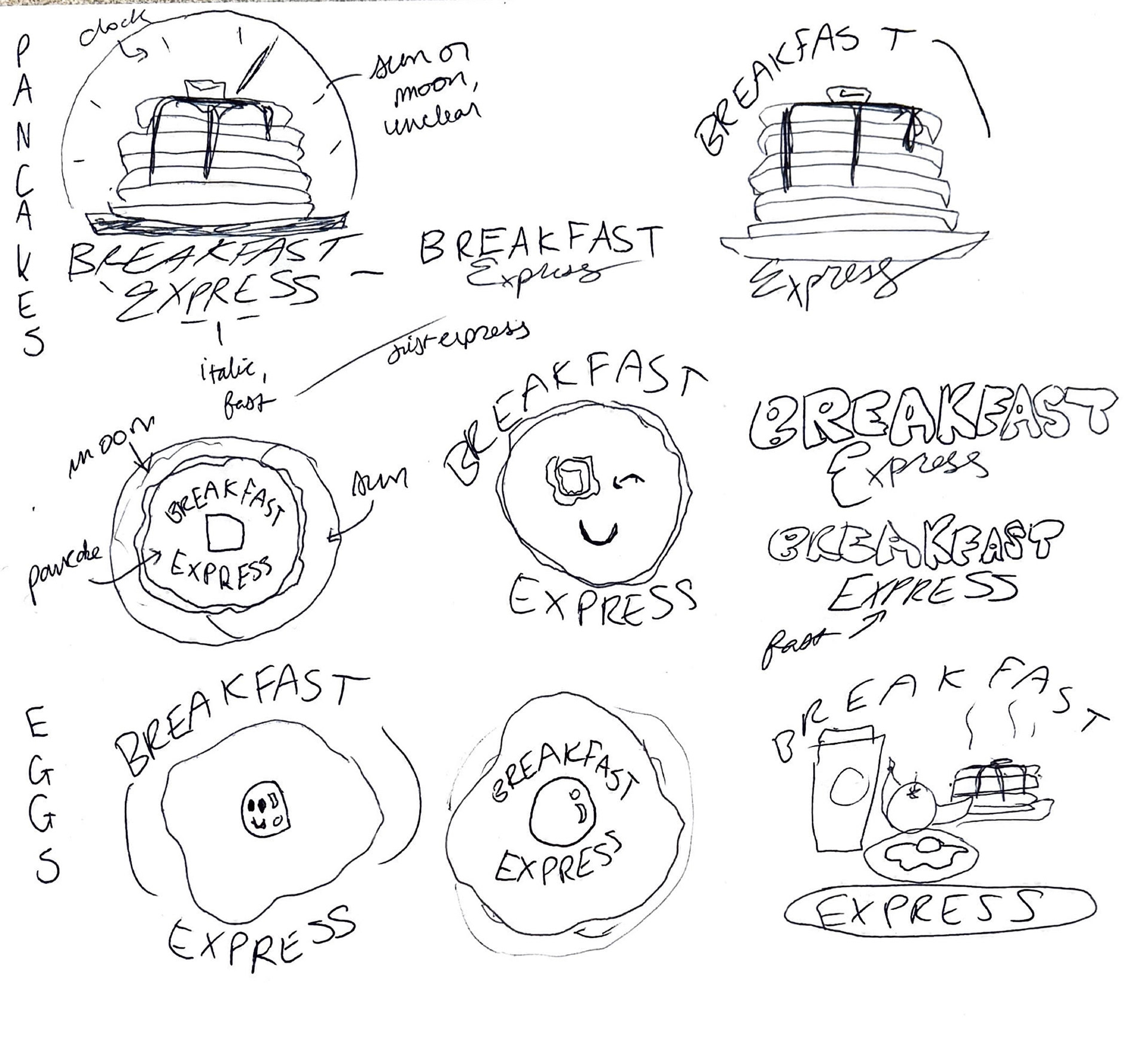
Breakfast Express
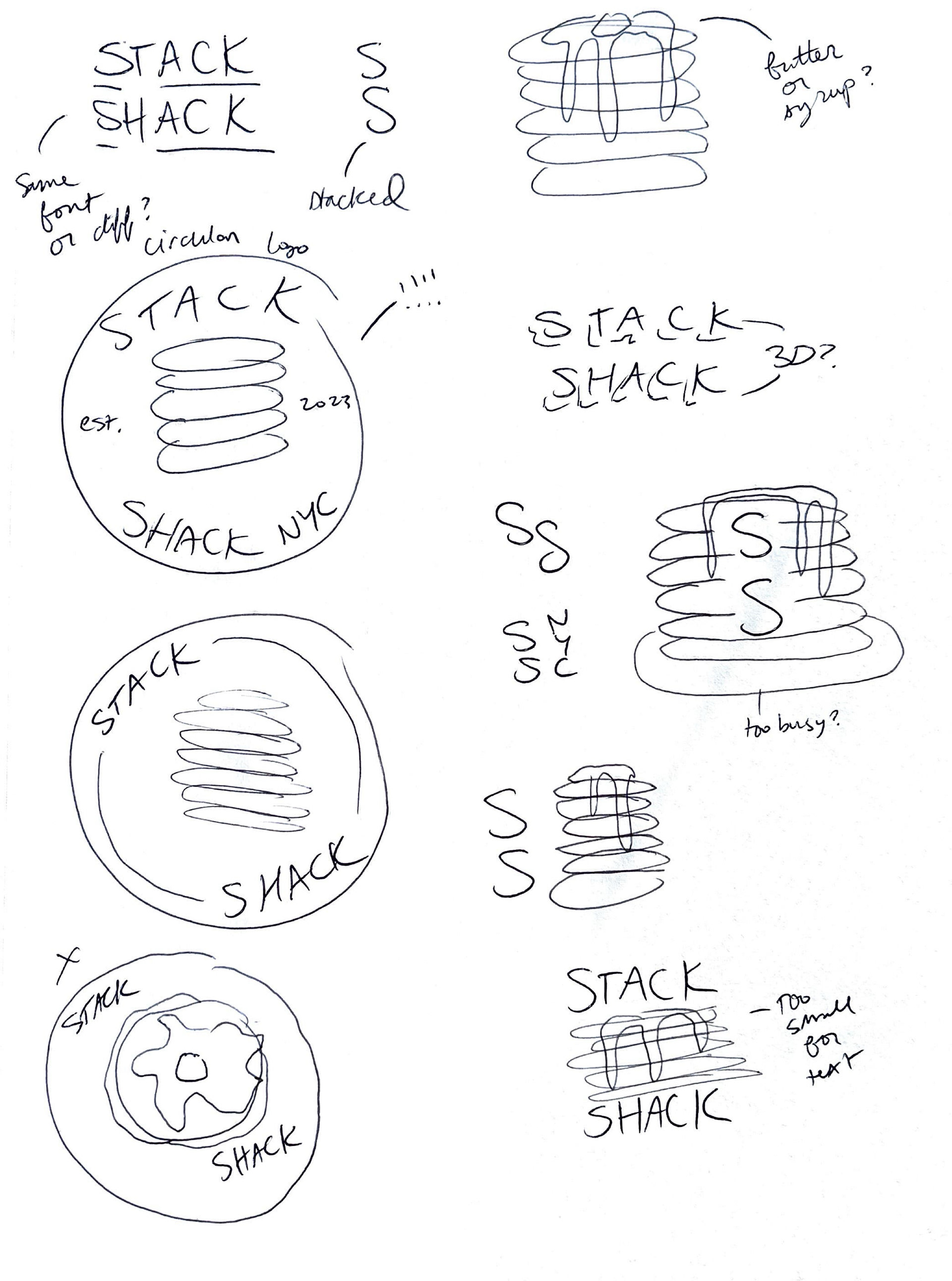
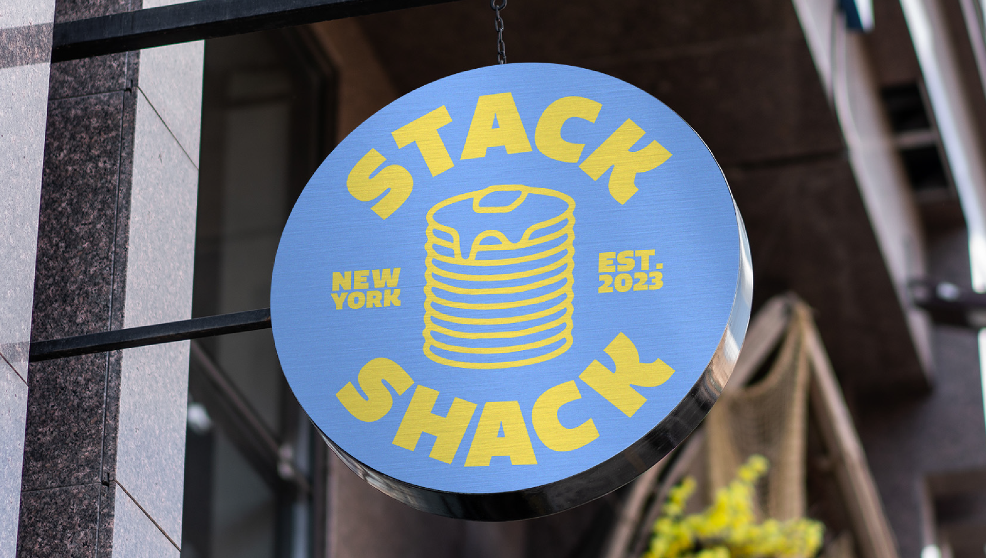
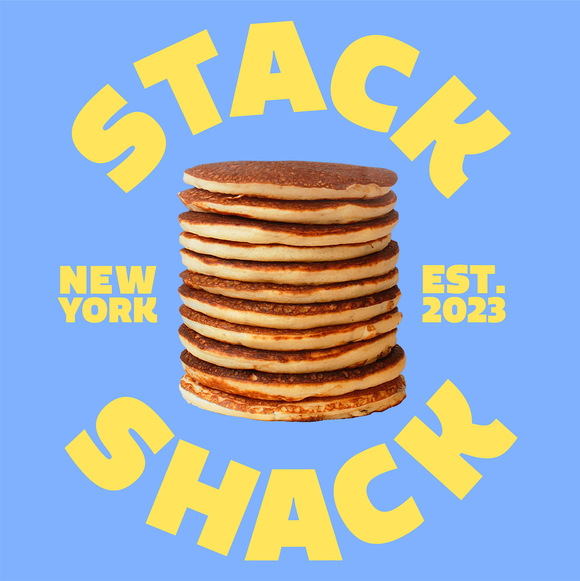
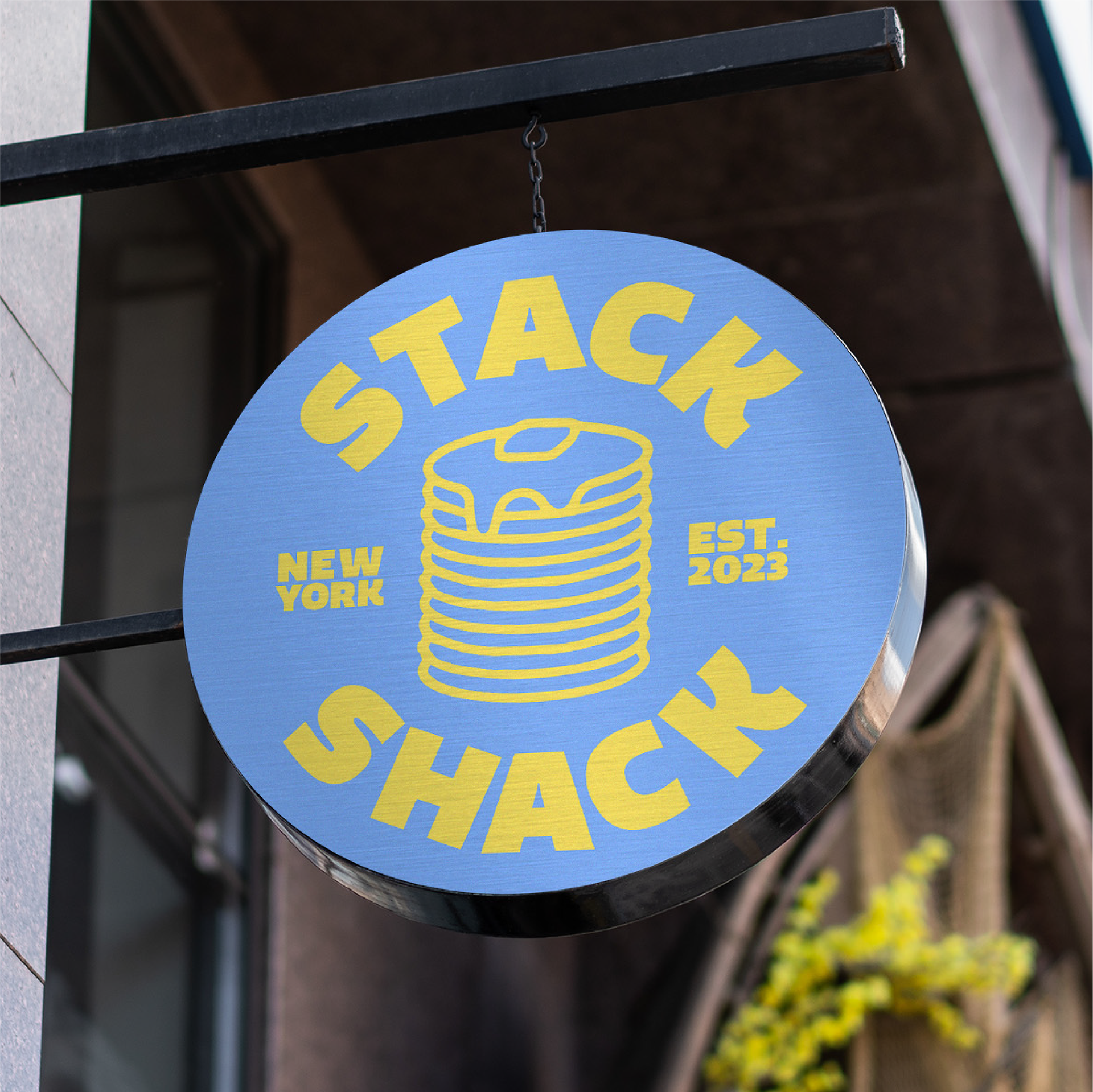
Stack Shack
initial ideas
At first, I was sold on the name "Breakfast Express," implying more of a typical 24 hour fast food experience. As the menu options were narrowed down to solely pancake creations, the name became "Stack Shack," and the logo was simplified.
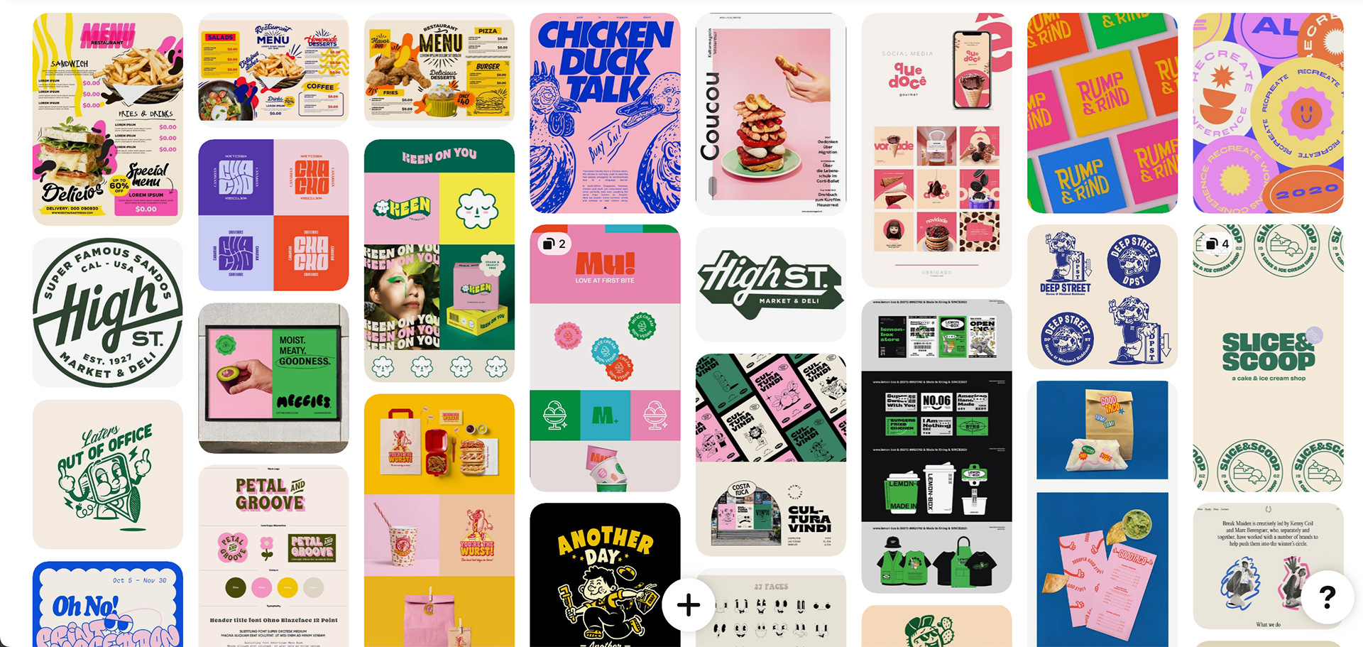
Inspiration
I turned to trusty old Pinterest to find other restaurants that utilize exciting, fun branding styles similar to what I had in mind. I found myself especially drawn to the use of simple but effective photography and eye-catching color palettes.
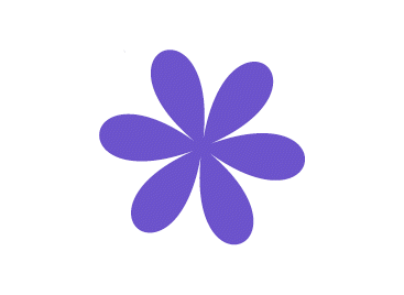
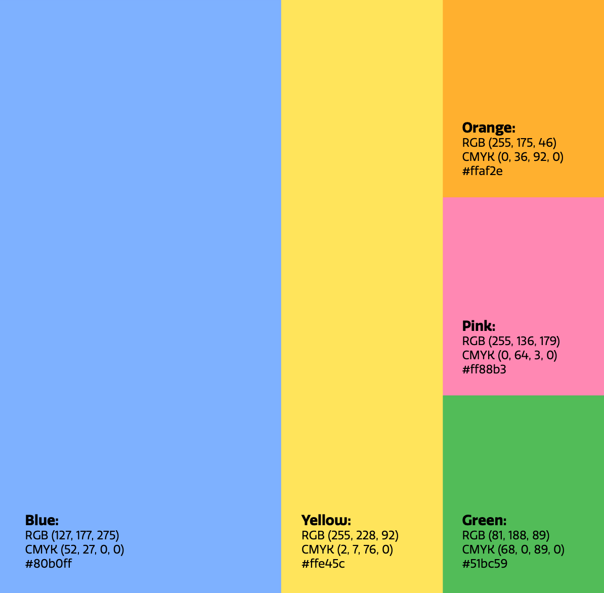
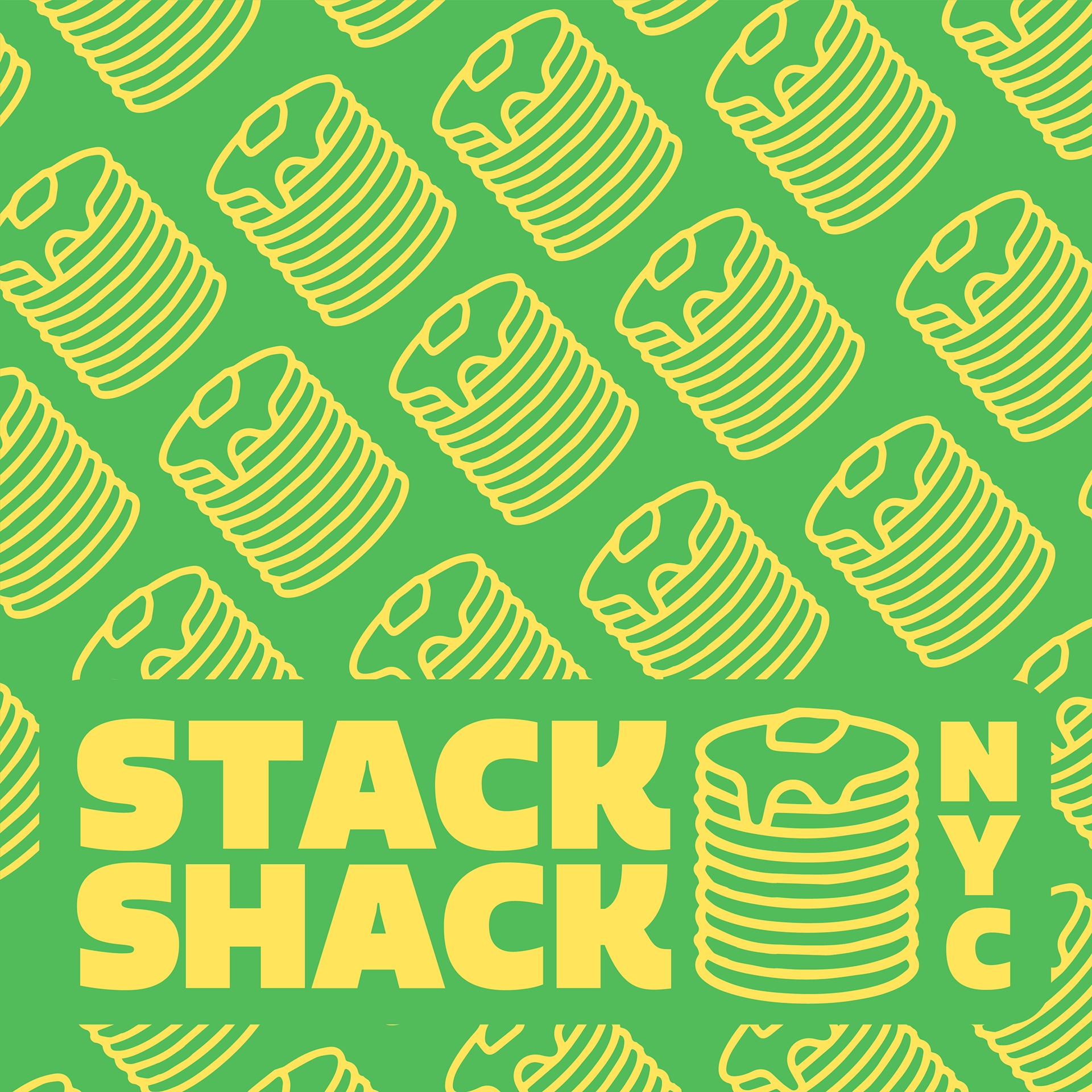
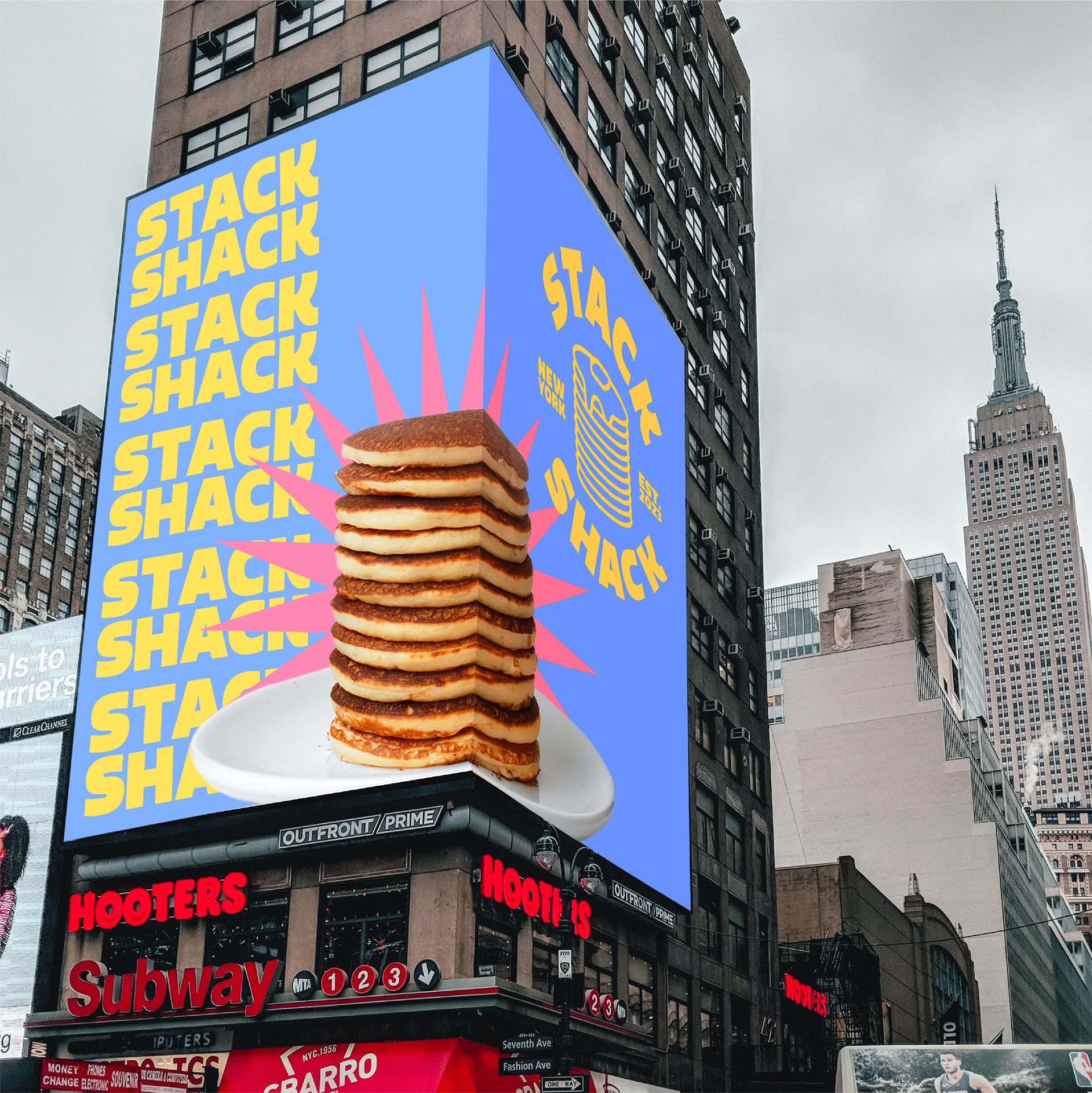
Color palette & Logos
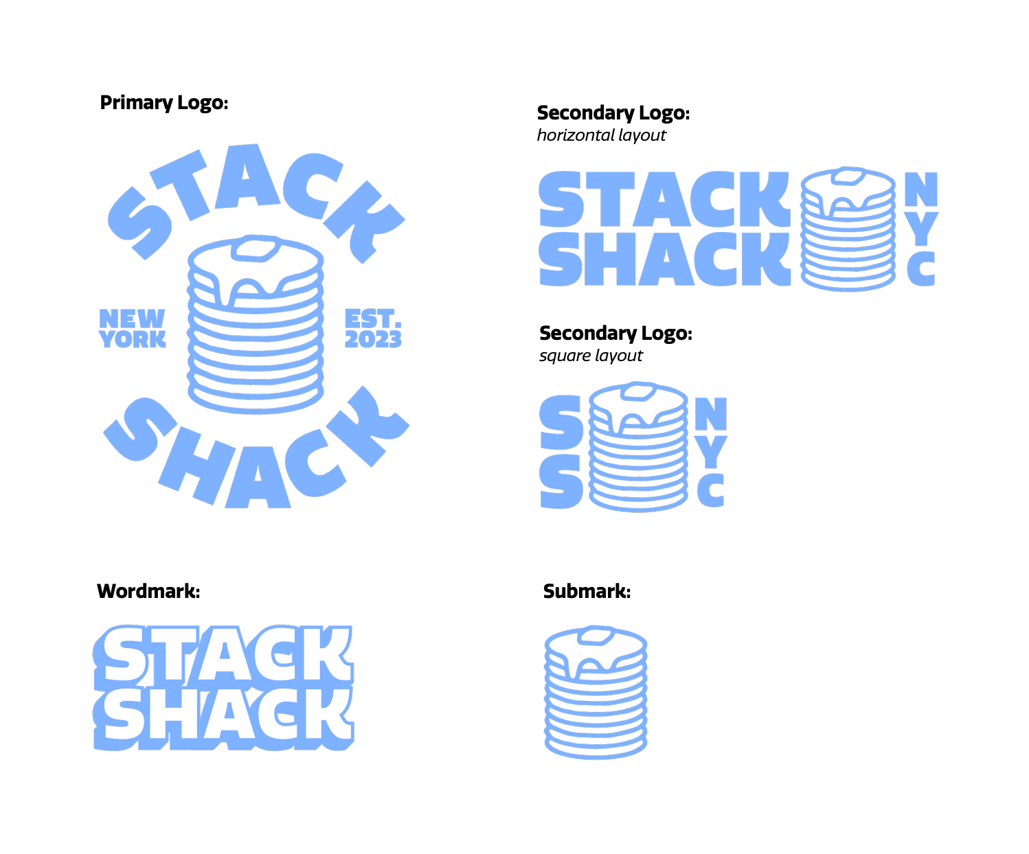
STYLE GUIDE PDF
This document entails key information about the brand split into six sections; brand values, logo, color, typography, imagery, and branded items.
Phase iii: Menu
Imagery
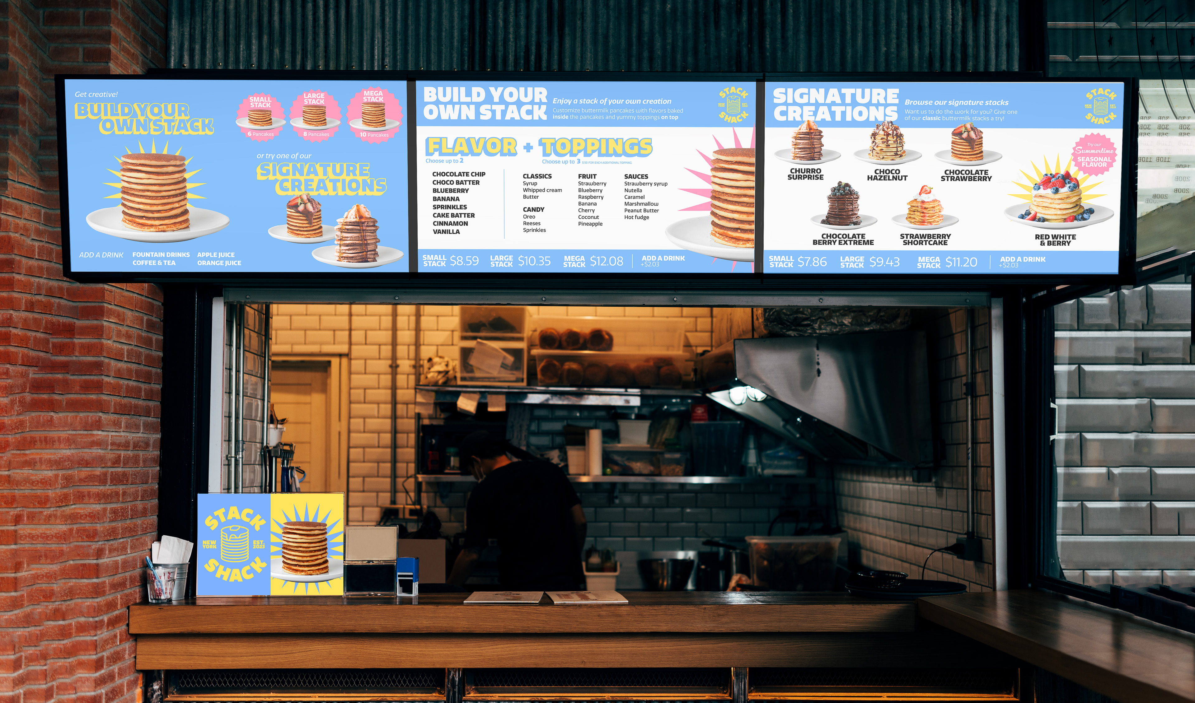
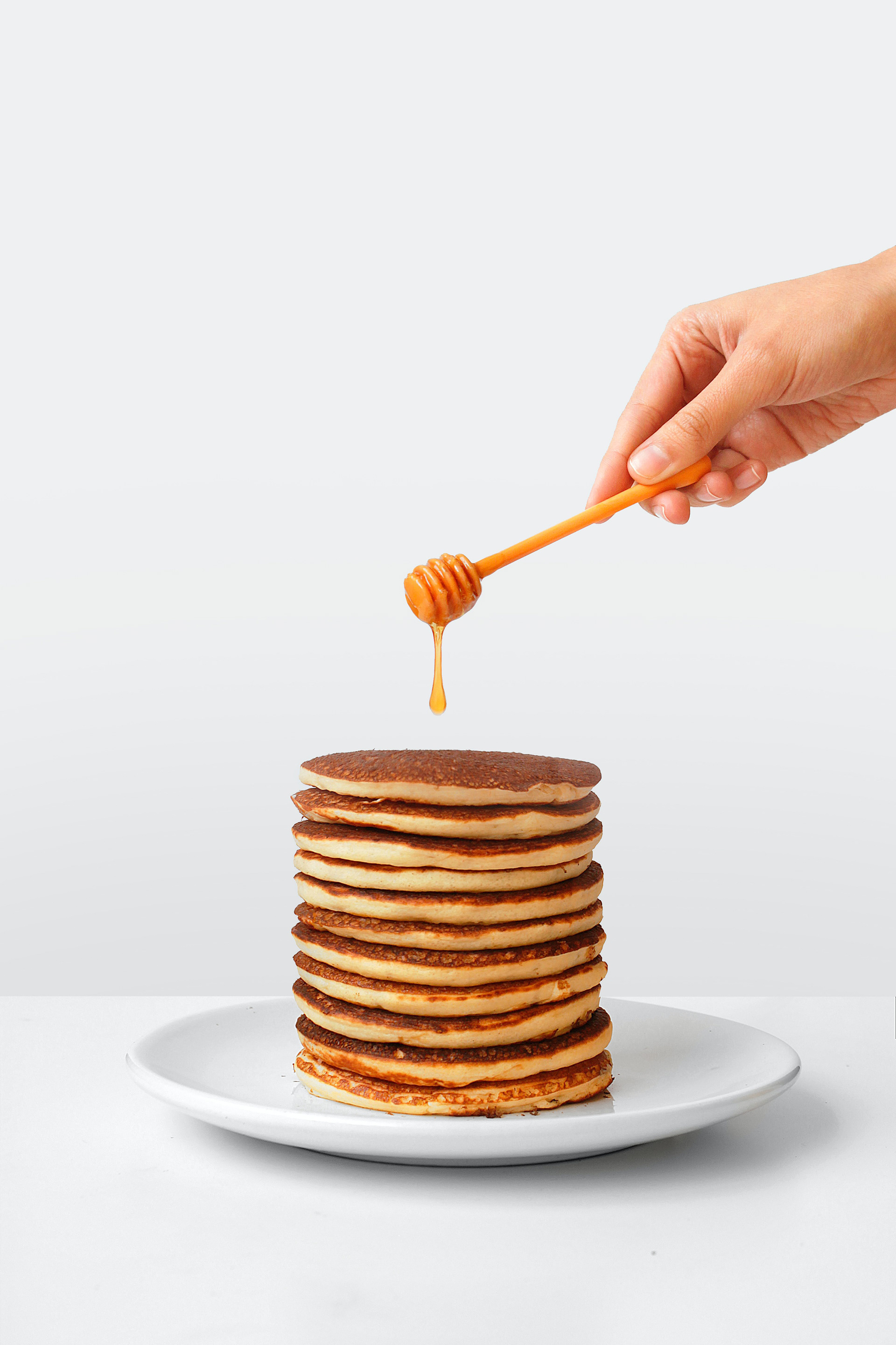
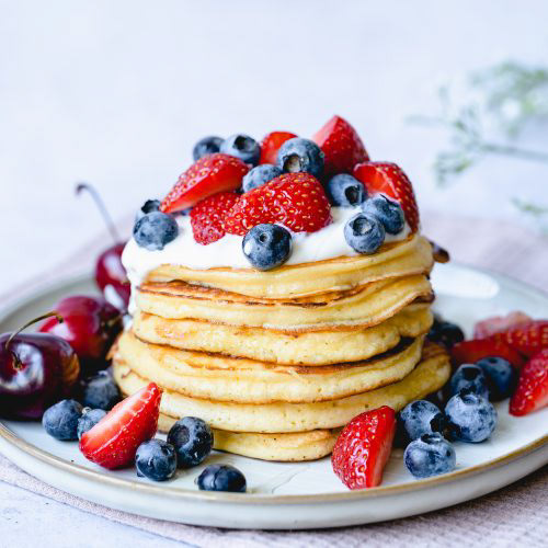
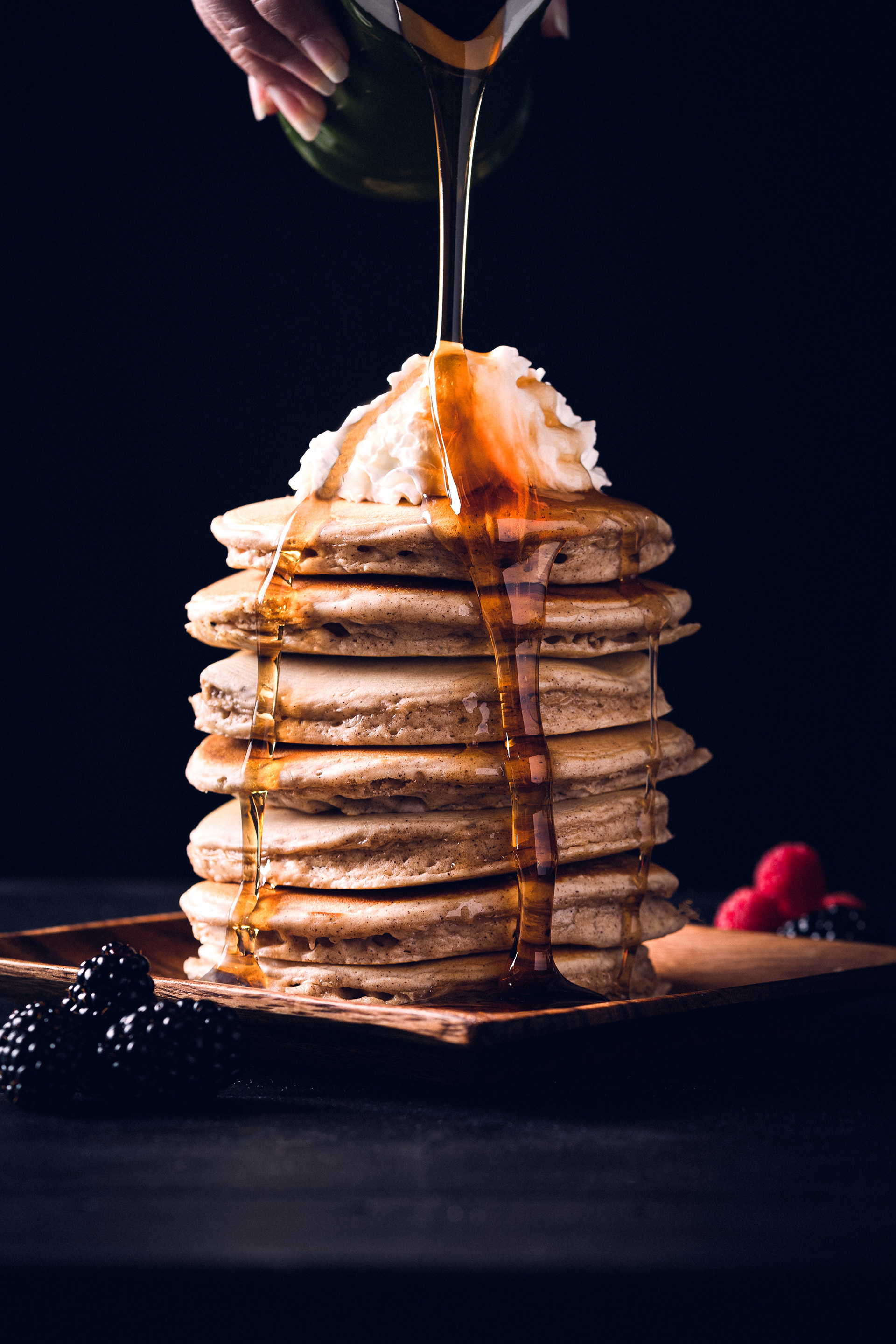
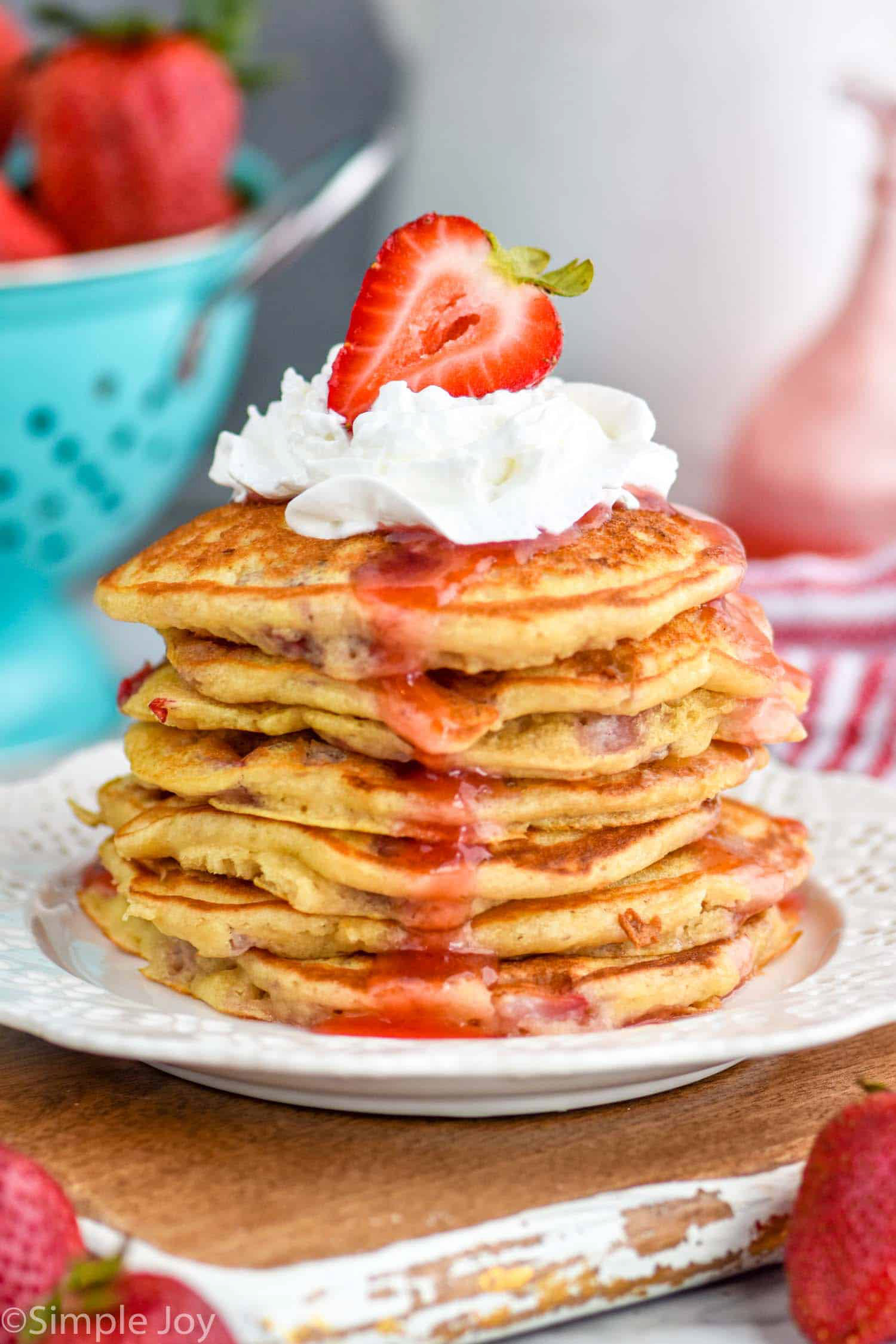
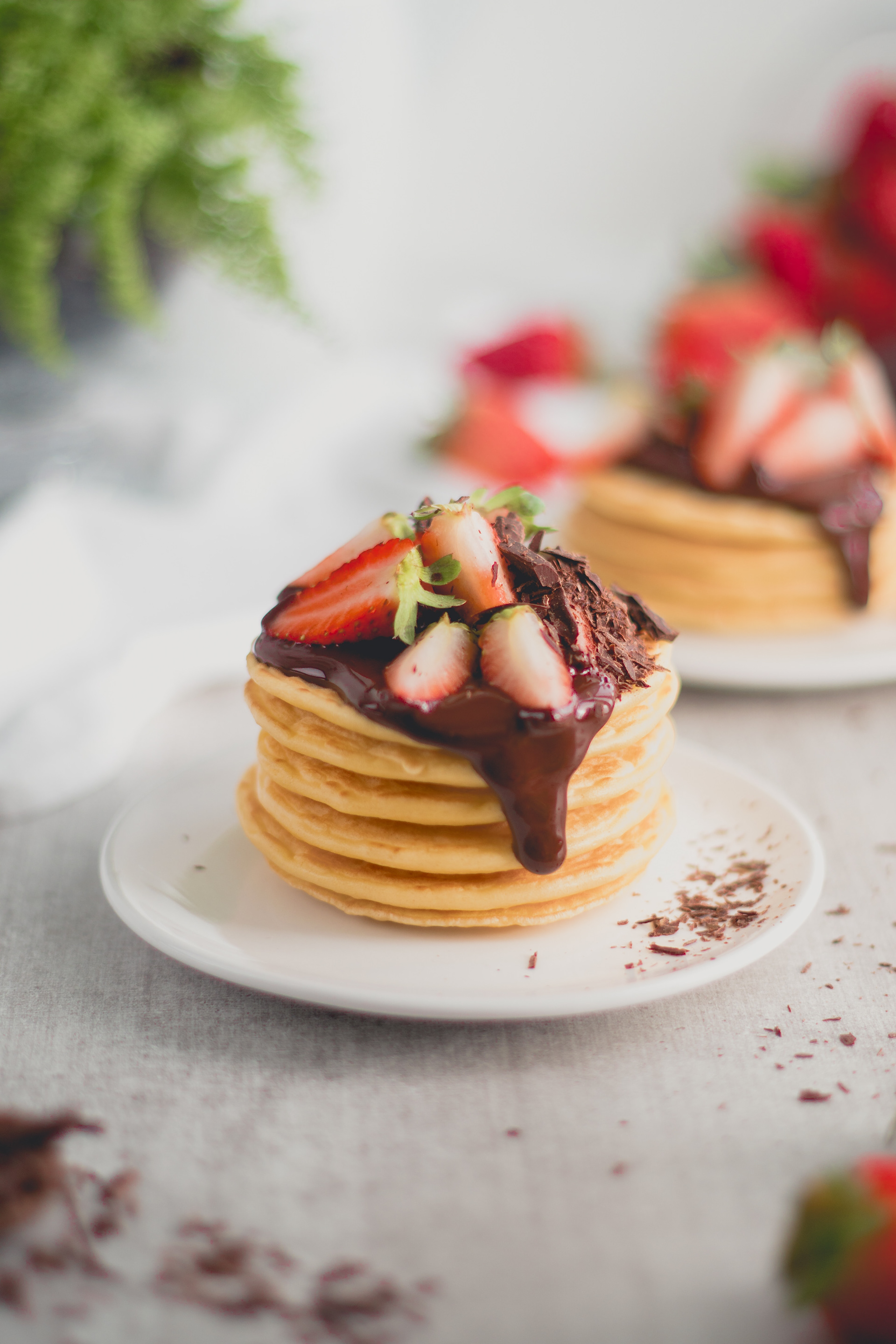
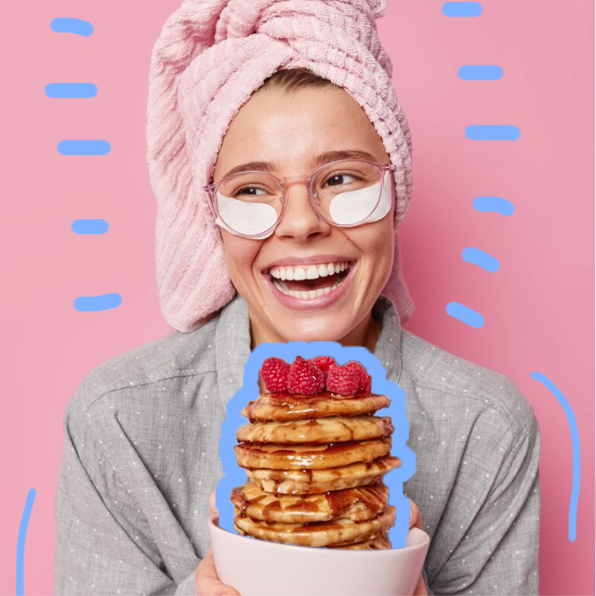
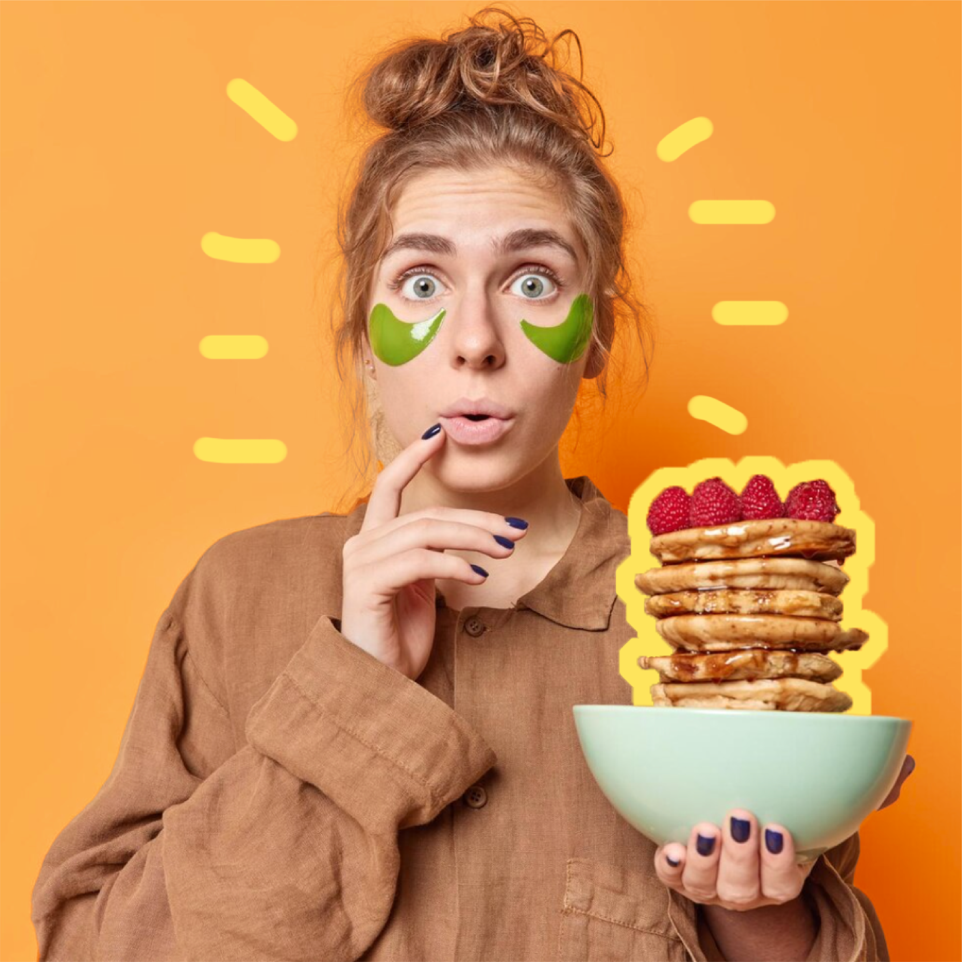
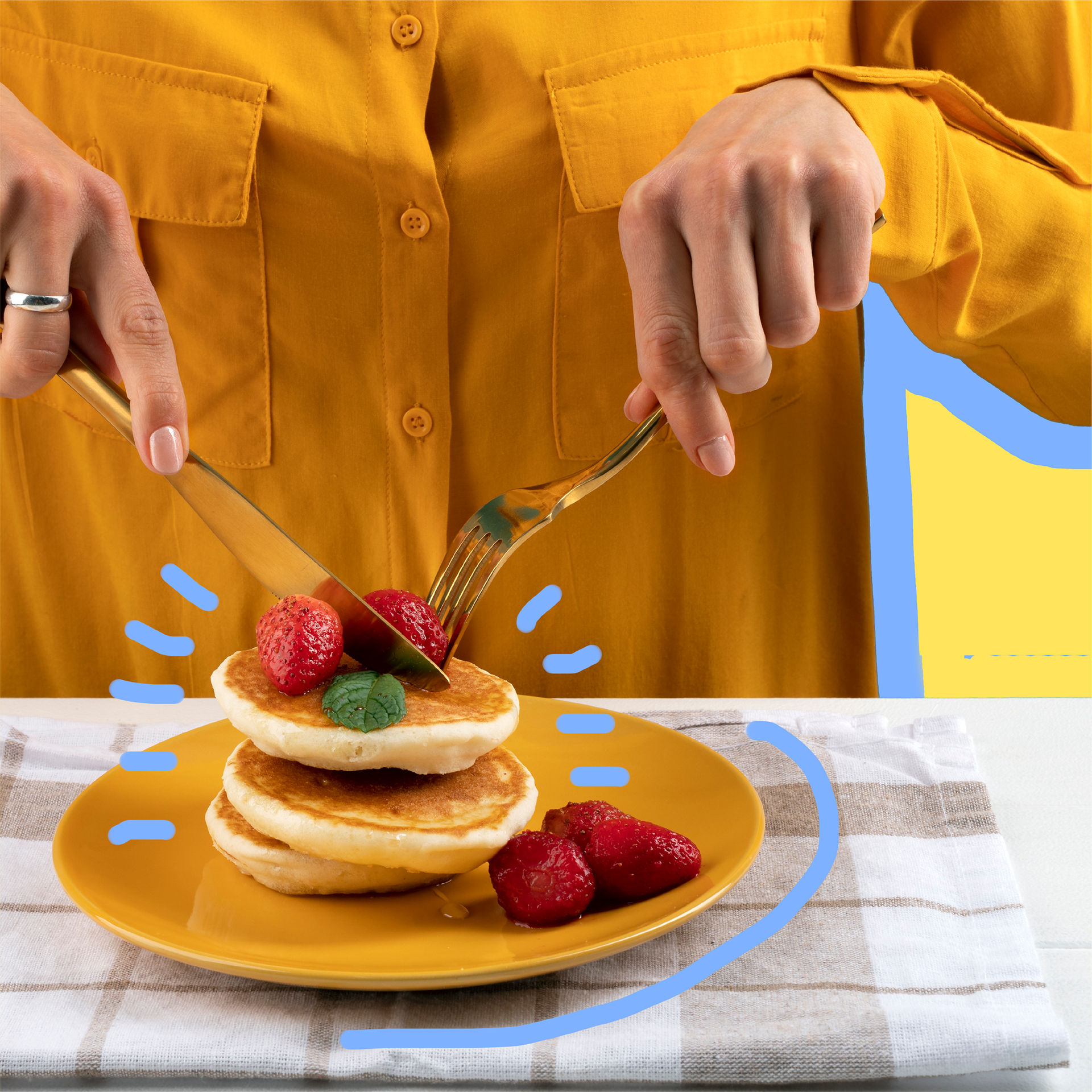
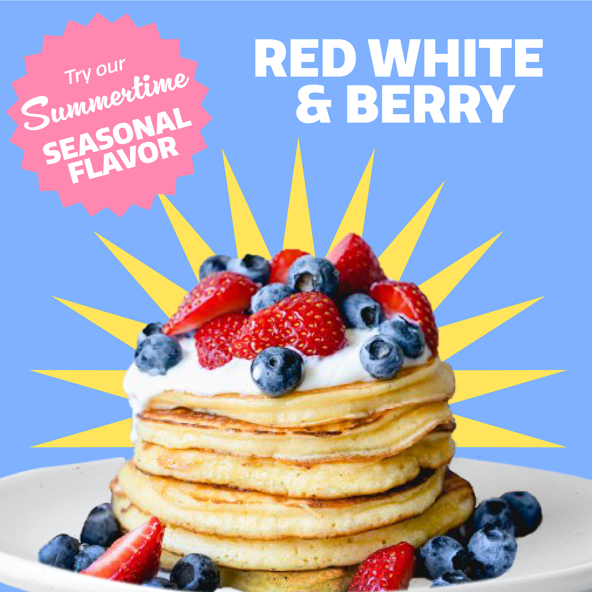
Because this project is ficticious, I used stock images of pancakes. These photos were retrieved from Unsplash.com and further manipulated in Photoshop to better fit the aesthetic of the brand.
Menu Items
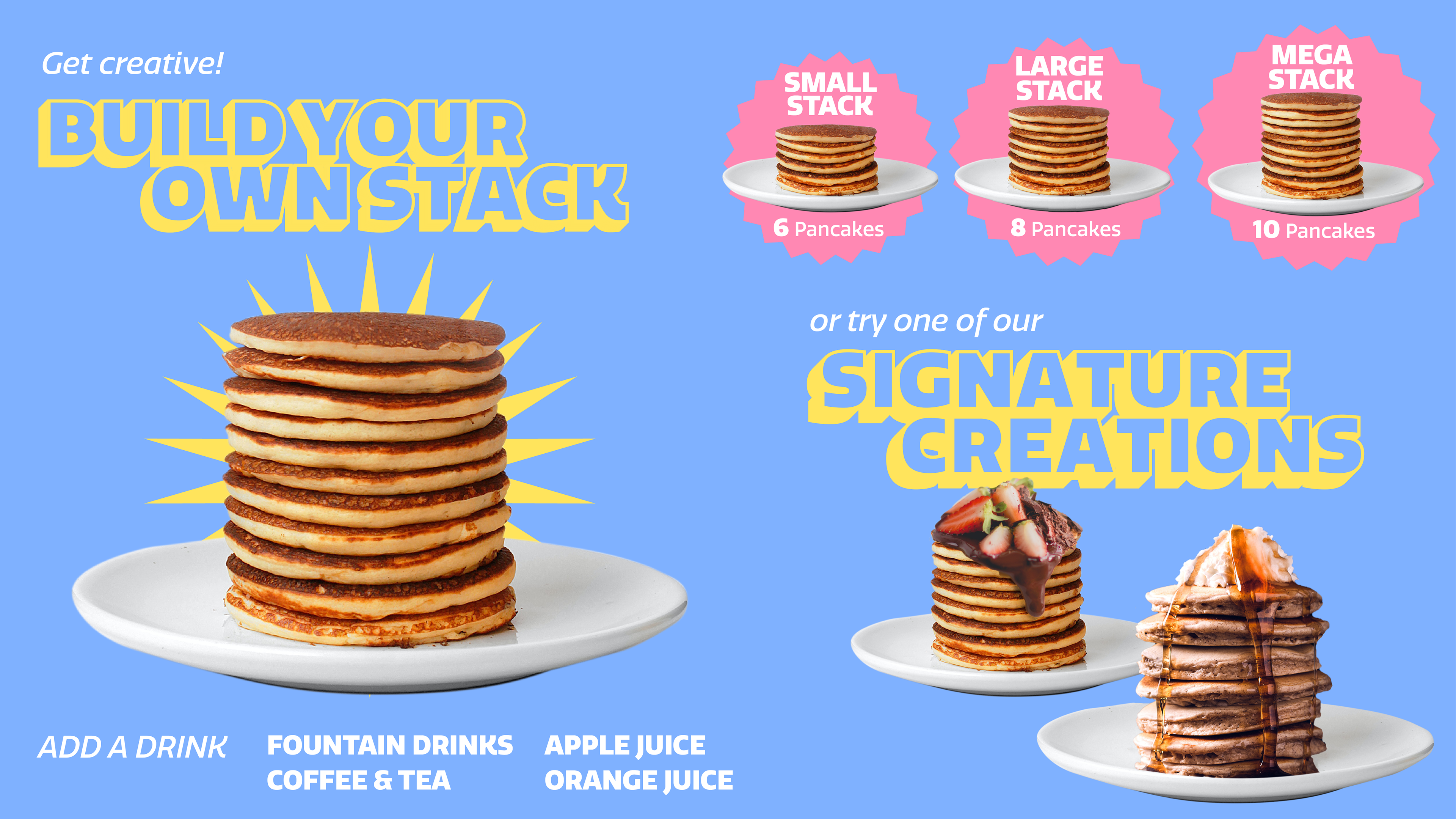
I decided to split the menu into two separate categories; Build Your Own Stack, where customers can customize their pancakes to their specific liking, and Signature Creations, a set of pre-designed pancake options. Having worked in fast food myself and knowing the struggle, I tried to keep the menu relatively simple to keep the flow of the restaurant efficient. Most of my decisions were based off of this initial brainstorm, and the signature creations were named according to the photos I found.
Menu Screens & Display
Introduction
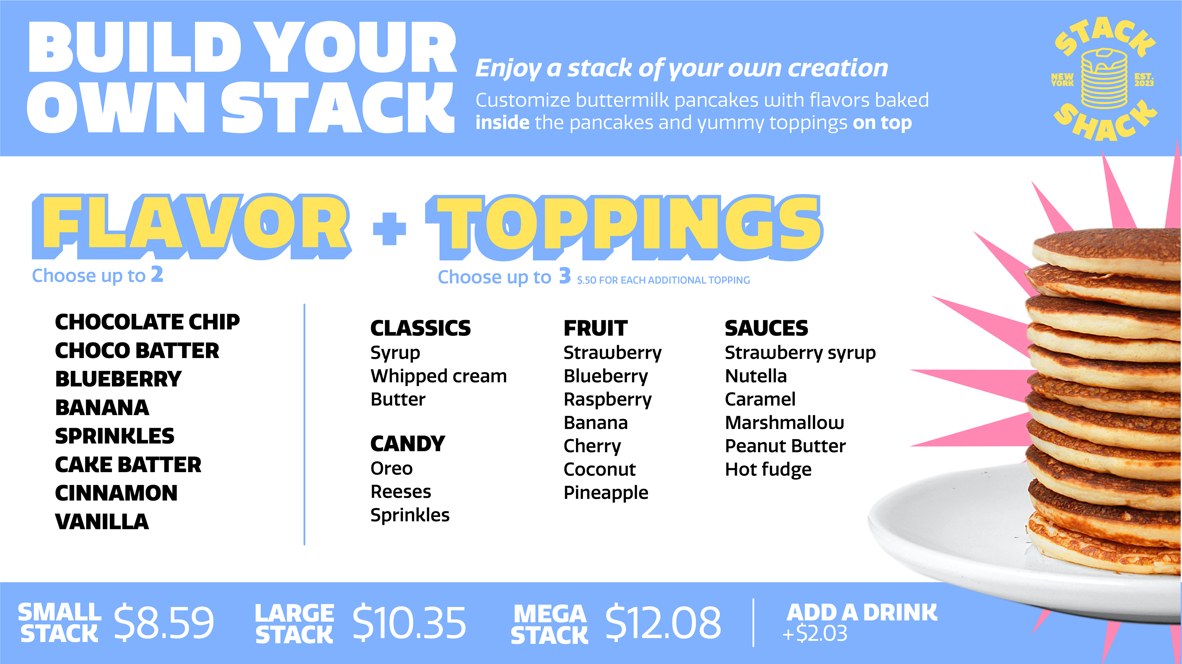
Build Your Own Stack
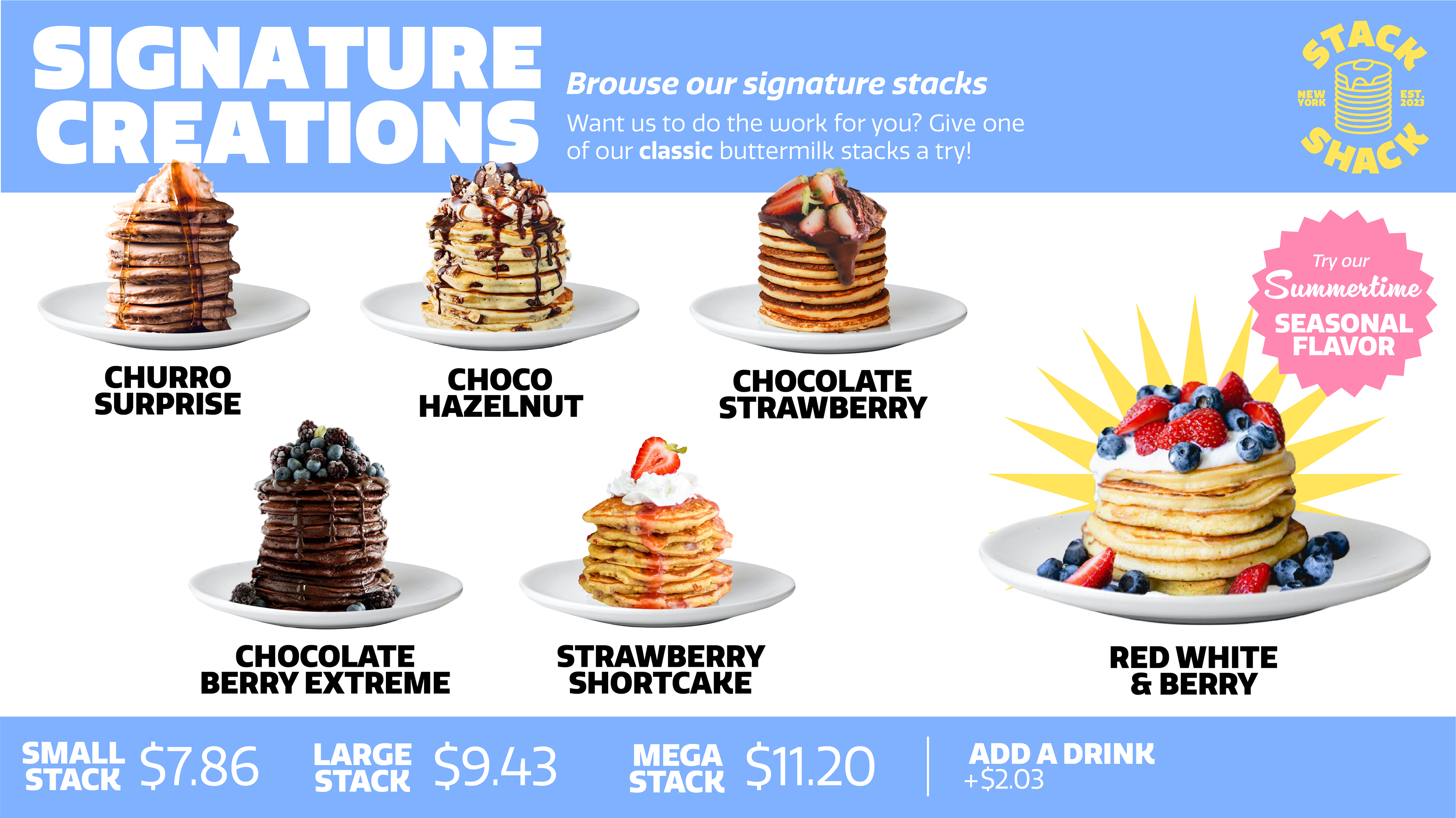
Signature Creations

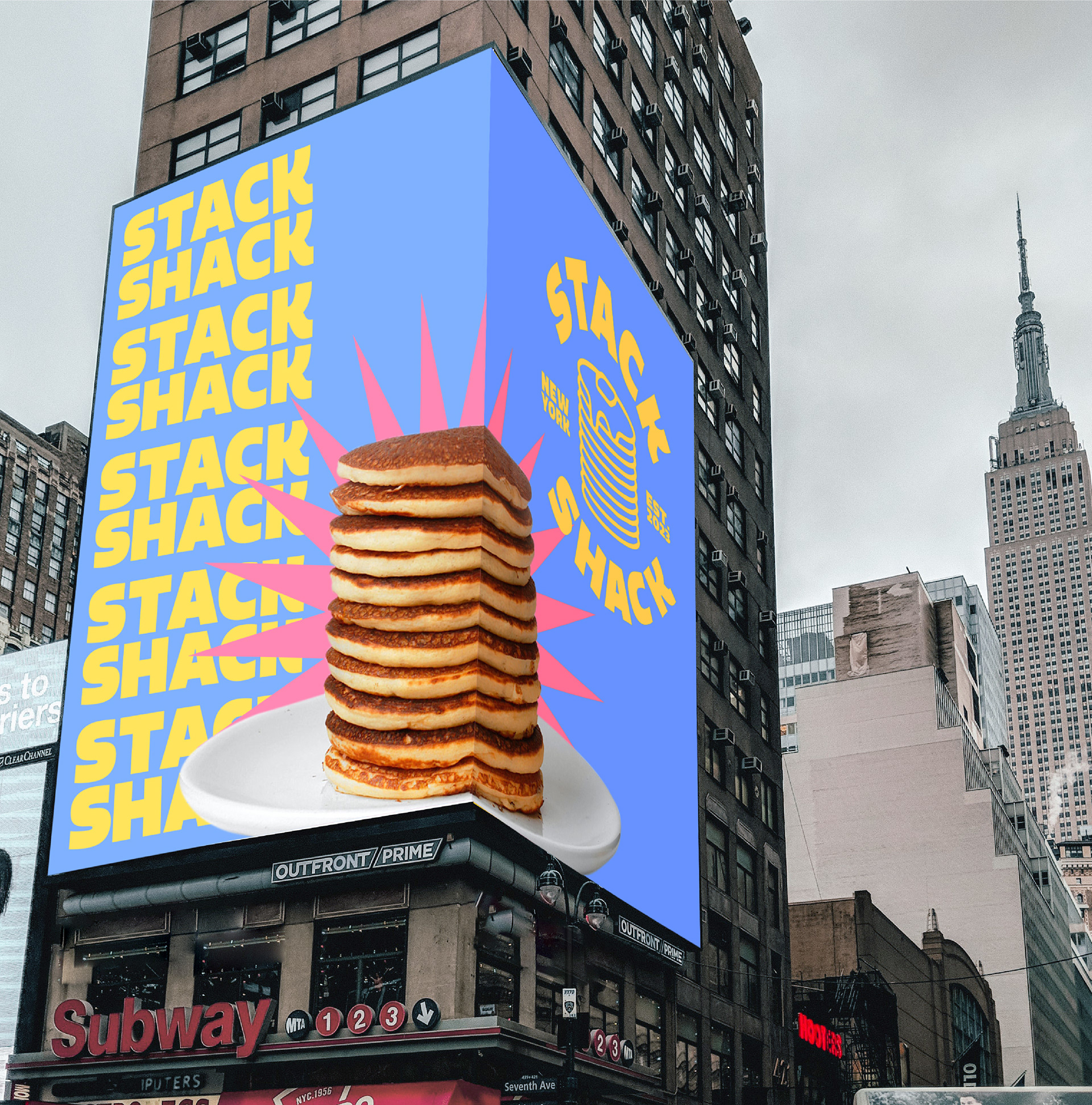
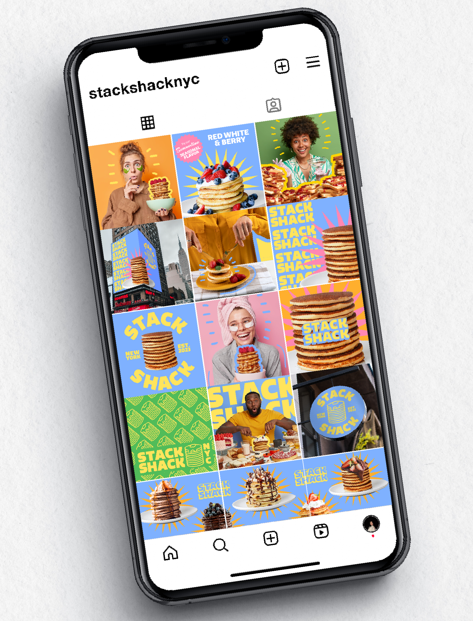
Phase iv: Social Media
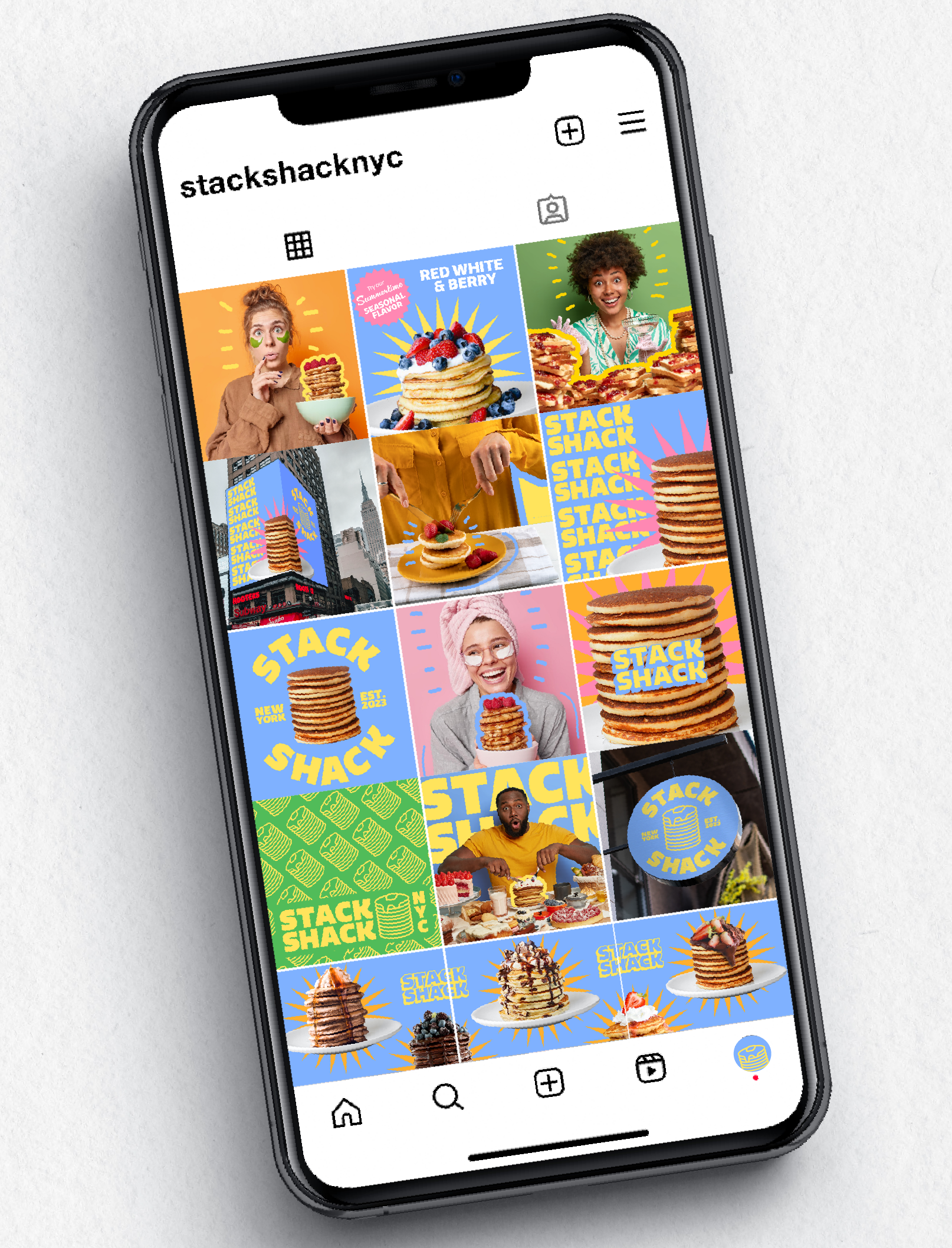
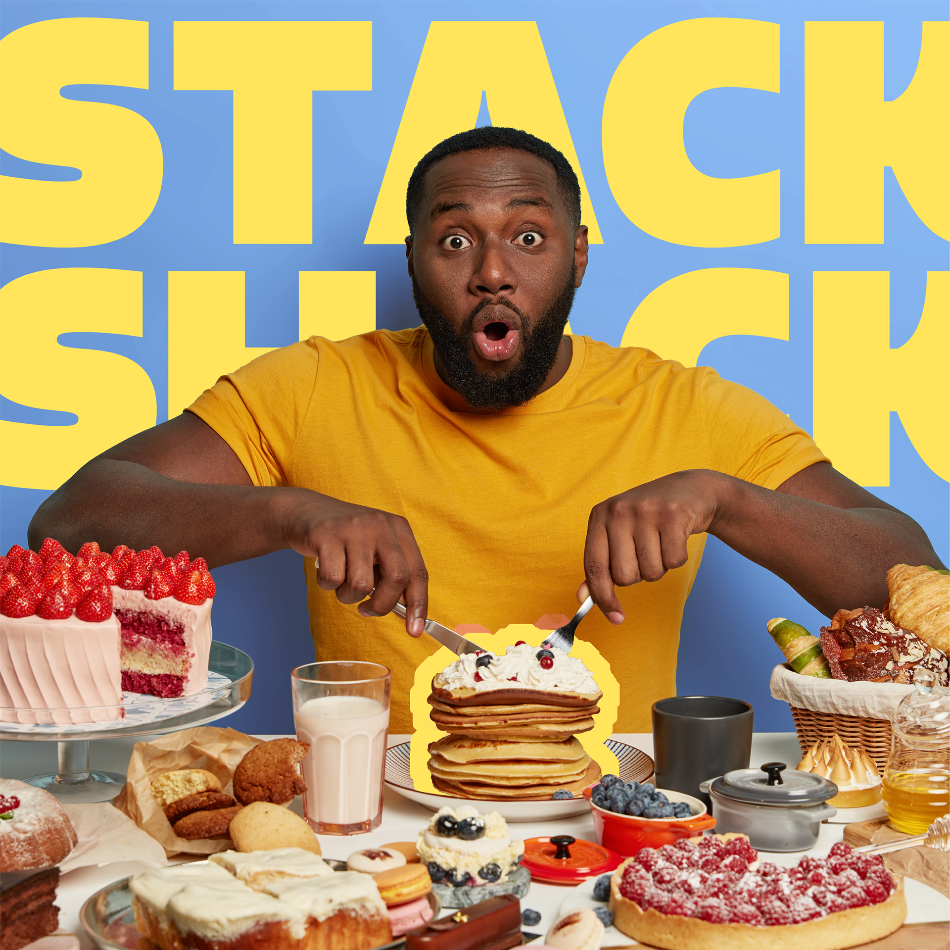
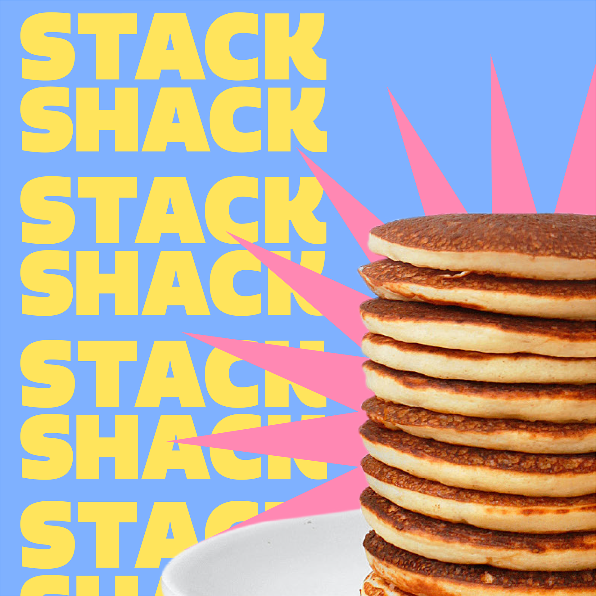
Instagram Graphics
Instagram can be an extremely useful platform for garnering wide-scale attention and establishing recognizable branding through the use of a cohesive feed. These graphics were created with this in mind, utilizing Stack Shack's bright and exciting brand ideals. The stock photography was downloaded from Freepik.com and further edited in Photoshop & Illustrator.

PHASE VI: Reflections
Obstacles
Initially I had a very difficult time making decisions regarding the name and logo. I progressed pretty far with "Breakfast Express," before deciding that I couldn't create a logo that I liked with that name. It felt like everything that I tried wasn't right; I couldn't get the pancake graphic, fonts, or color palette to feel authentic or even close to what I had in mind. I didn't want to scrap the idea entirely so I went back to the beginning and scaled down the restaurant to focus on just pancakes, which helped massively to adjust the big picture. I find that sometimes I start projects too big with too many ideas/goals, and I'm able to get farther when I simplify these ideas and create some more restrictions for myself.
Moving FOrward
This project could benefit greatly from a UI/UX aspect, that being an order kiosk. Since the prerogative of this restaurant is to encourage creativity, the kiosk would utilize exciting interactive elements that work nicely with the established bright, fun branding. The customer might feel they have more freedom to visualize all the options and feel comfortable to try whatever outrageous topping choices they want.