Role:
SOLE DESIGNER - Concept Creation, UI/UX Design
Timeline:
Nov-Dec 2021 (2 months)
Programs:
✽ Miro
✽ Adobe XD
Deliverables:
App Prototype
Overview:
Drinking water is a crucial aspect of life that many of us tend to ignore, whether it be due to our busy schedules or just simply forgetting to have a few cups throughout the day. With the increased amount of water in the body daily, many health issues can be avoided and lessened, along with many positive impacts such as clearer skin and better digestion. The DRNK app intends to integrate the habit of drinking water into the user's daily routine, while creating a fun environment to encourage community engagement and support.
Process
Phase I: Research
Competitive Analysis:
Below are some existing smart water bottles and app pairs with a similar concept to mine. Both consist of a smart water bottle that connects to the app via Bluetooth, keeping track of the amount of water consumed throughout the day:
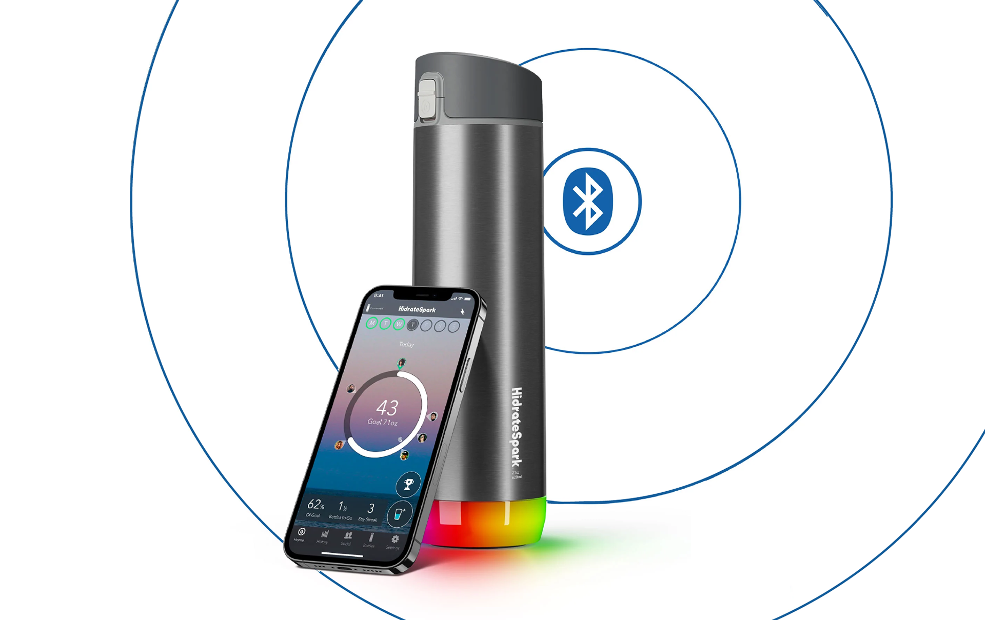
Hidrate Spark
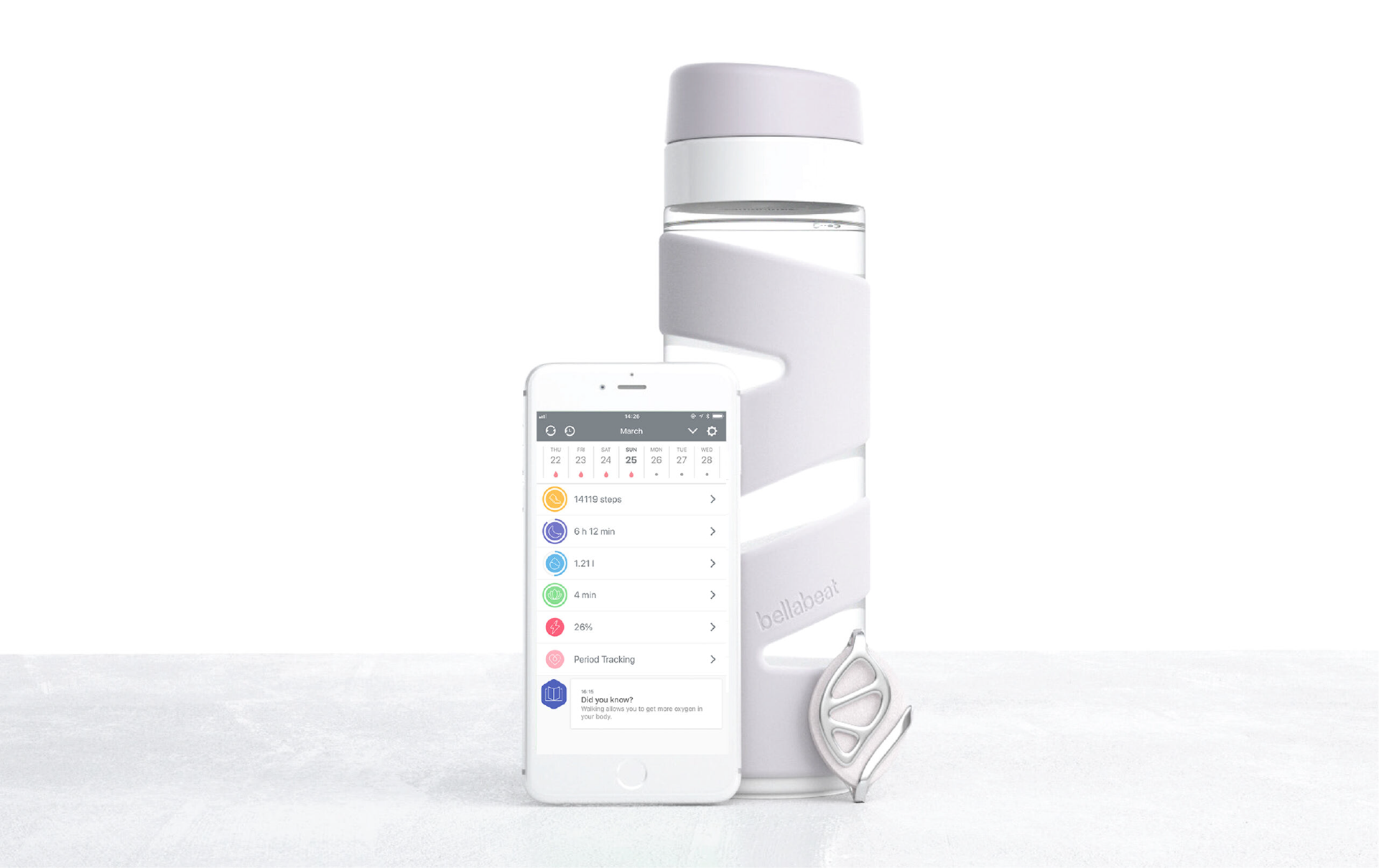
Bellabeat
Hidrate Spark:
FEATURES:
• Bottom of bottle glows as a reminder to drink water
• Information can be inserted manually without the water bottle
• Review history, connect with friends, earn trophies, customizable settings
PROS:
• Water bottle has nice design; sleek & compact
• App can be used with or without purchasing water bottle
• Many opportunities to customize settings
CONS:
• Inconsistent design elements
• App page structure confusing at times
Bellabeat:
FEATURES:
• Water bottle is synced to the app when shaken
• App can be used to track other types of goals
• Tracks history
PROS:
• Water bottle lasts up to 4 months without needing to be charged
• Other goals can be tracked along with water intake
CONS:
•Targeted more toward women
• App has extensive amount of features/confusing infrastructure
• App partially requires expensive membership
Audience
Busy younger adults interested in health/wellness
Goals:
✽ Integrate habit into user's daily routine
✽ Create a fun/playful environment
✽ Encourage social engagement
✽ Create a simplified interface
Phase II: Design Process
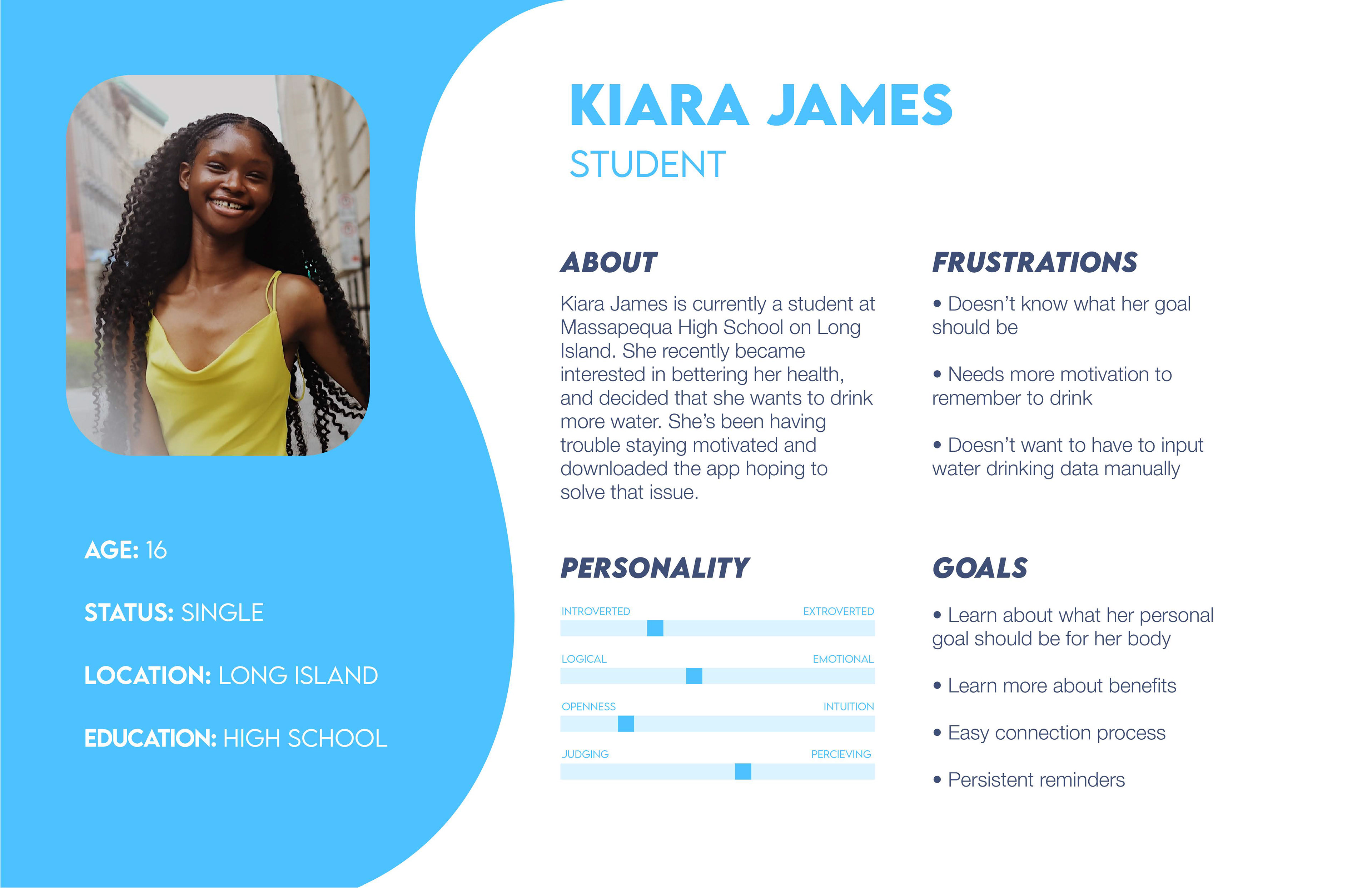
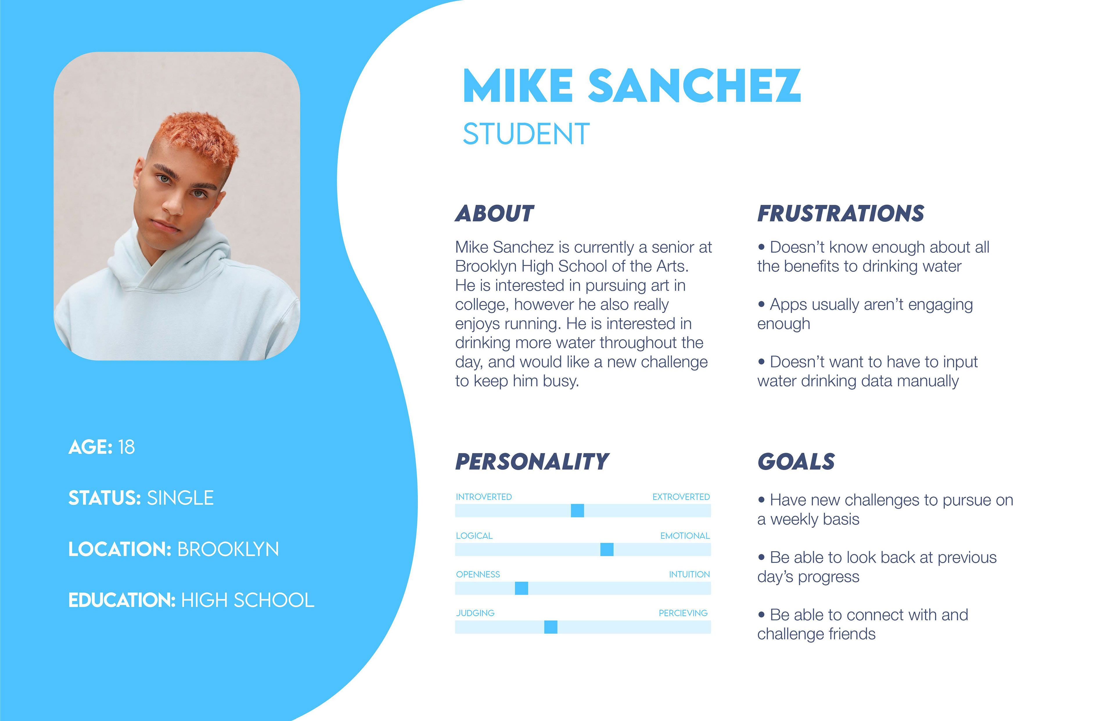
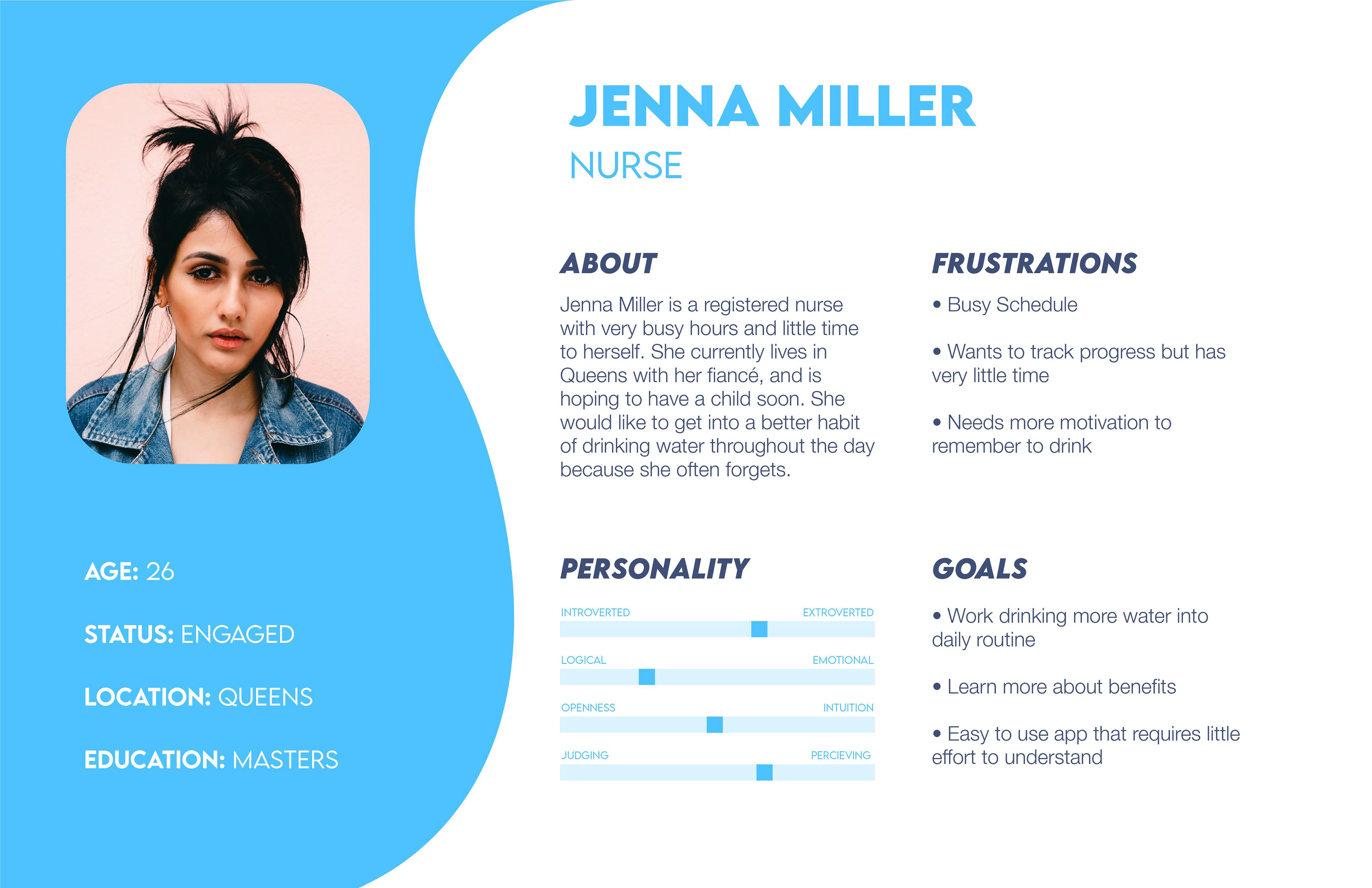
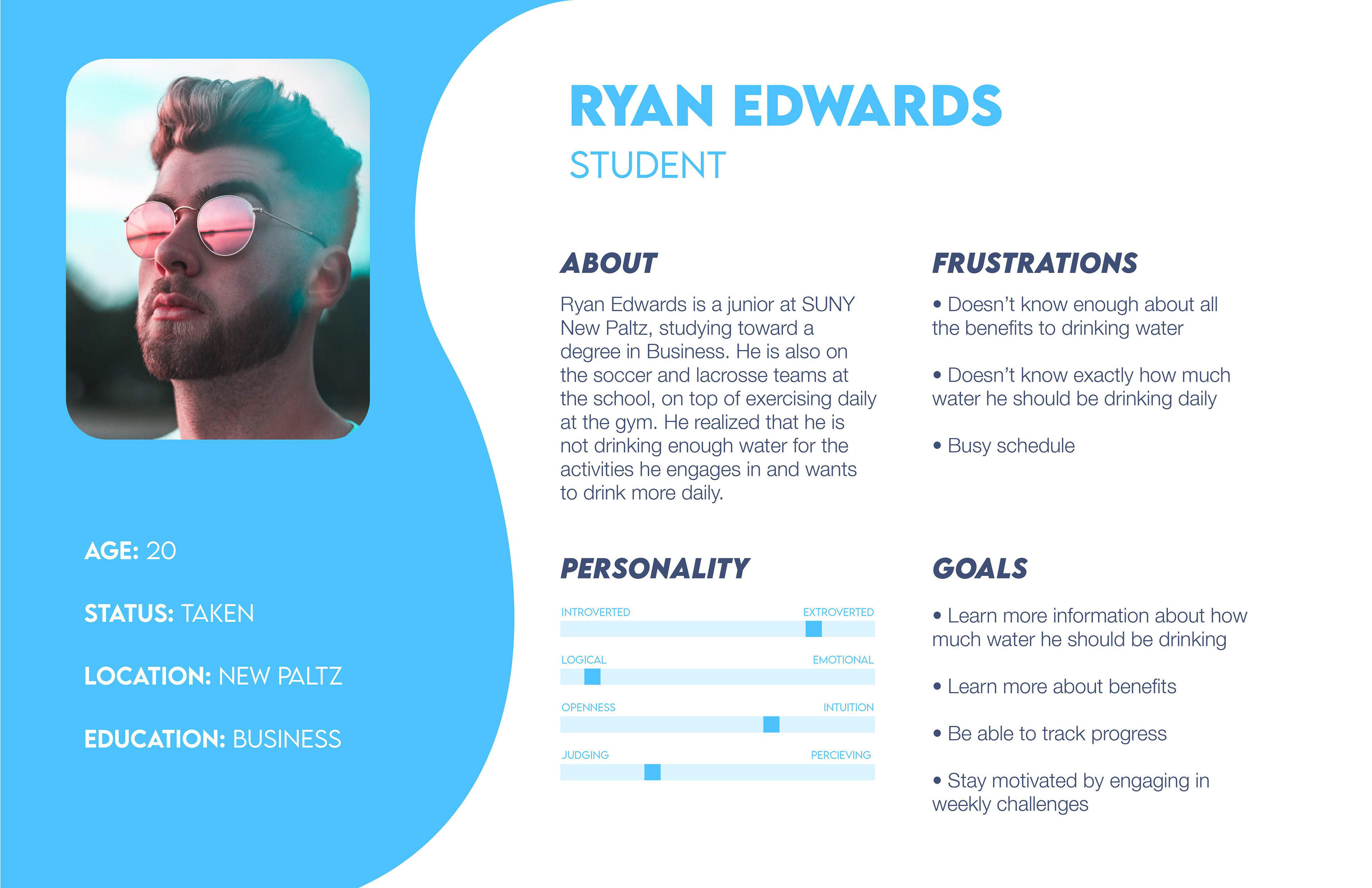
Personas
This app is targeted toward younger athletic adults, therefore these four personas detail their individual needs and goals that could be satisfied by using the DRNK app.
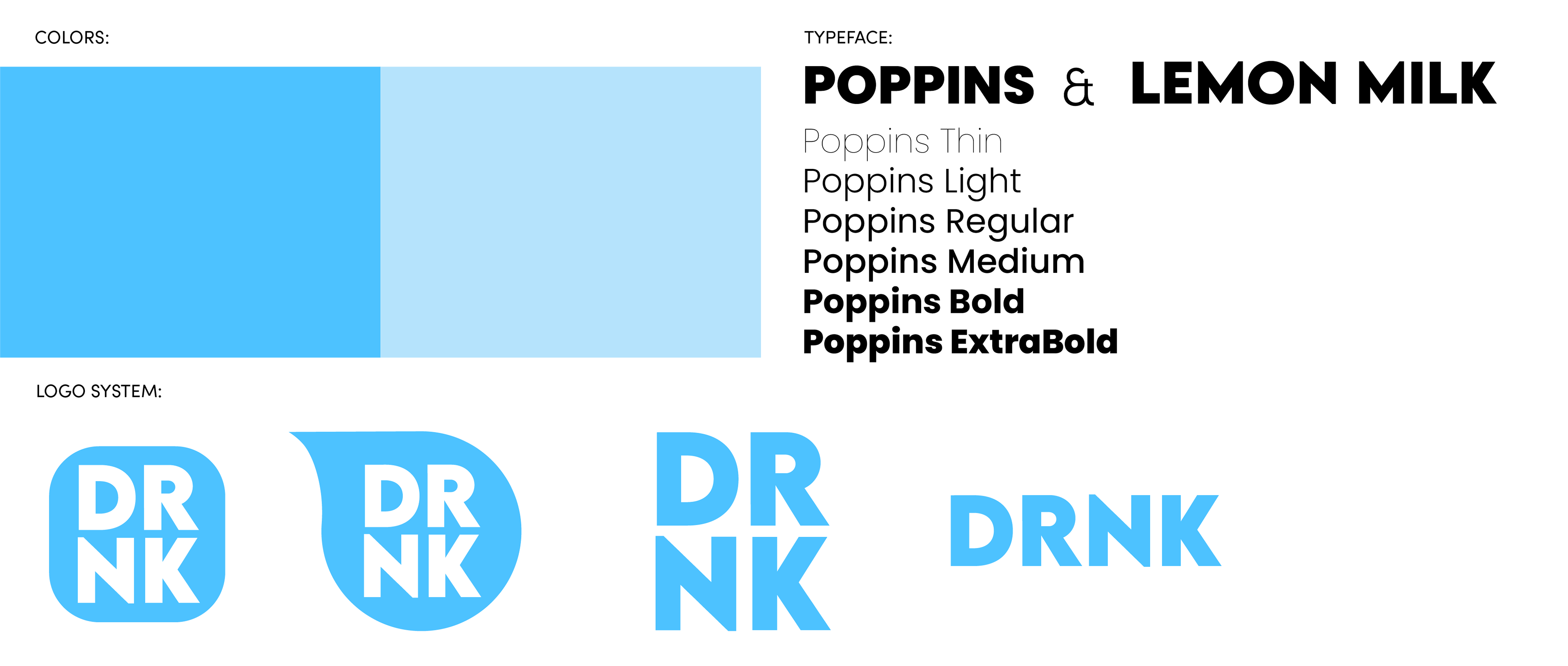
Branding
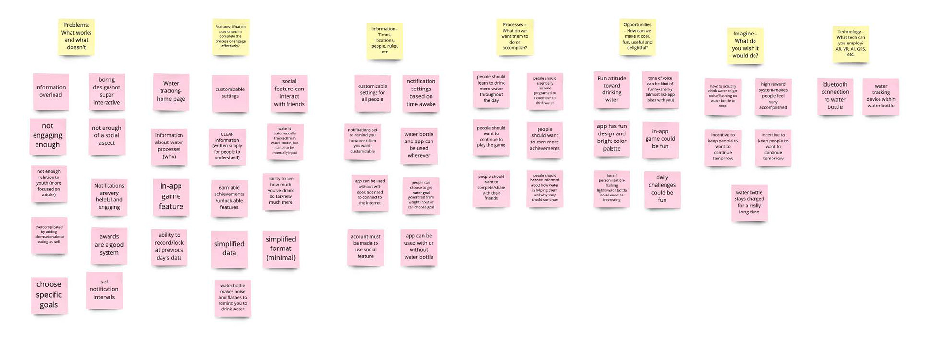
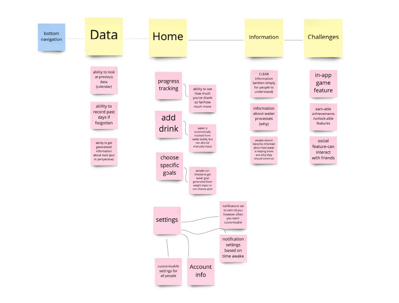
Affinity Diagram/Card Sorting
The affinity diagram is a great way to get the ideas flowing, really pushing the app to its full potential. These ideas were further sorted and arranged into a possible app configuration in the card sort.
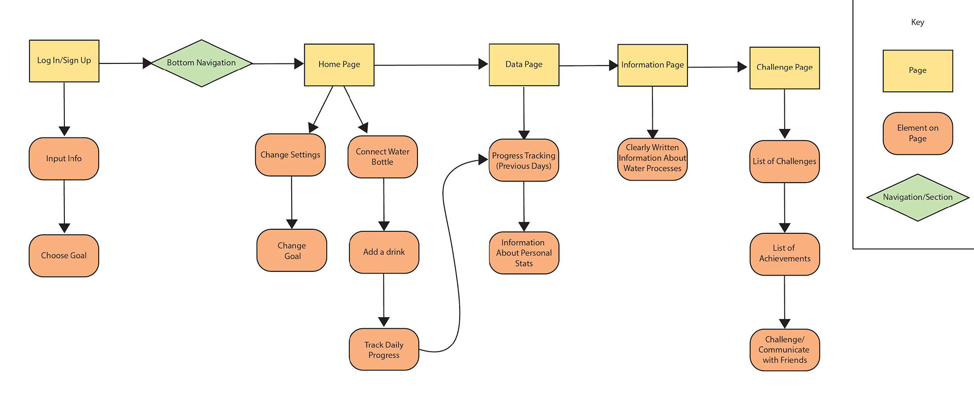
Information Architecture
After sorting out ideas for this app, this was the framework I decided on. The app would consist of a login screen and four main pages; the Home Page, Data Page, Information Page, and Challenge Page.
✽ Later on in the process, the Information Page was swapped out for a Social Page.
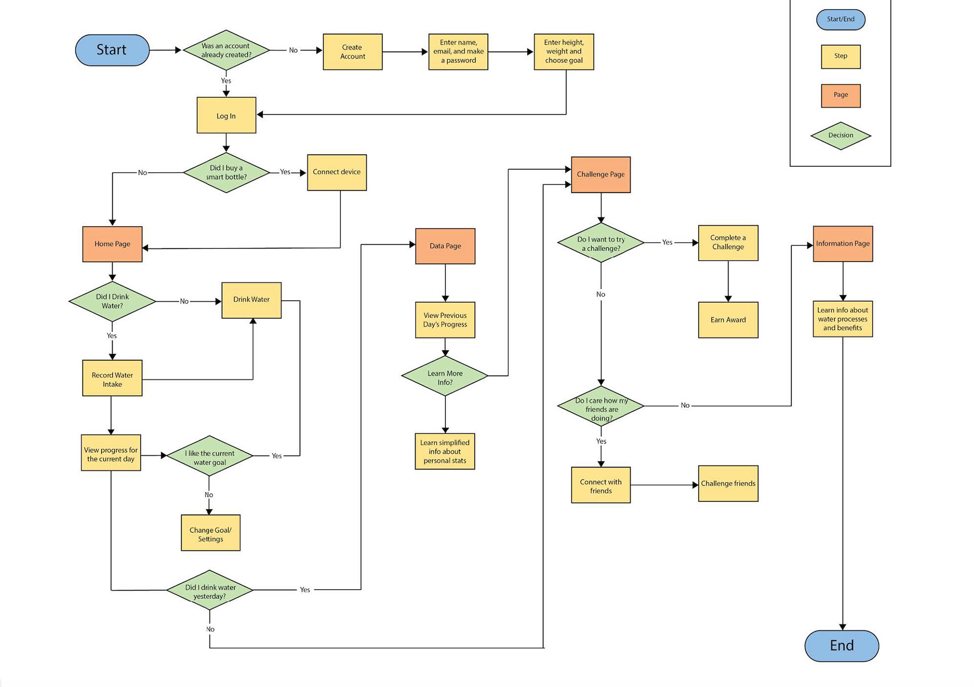
User Flow
Creating the user flow allowed me to see some flaws with the infrastructure I had created so far. Considering the results of the survey and this flowchart, the Information Page was beginning to seem unnecessary and a bit irrelevant.
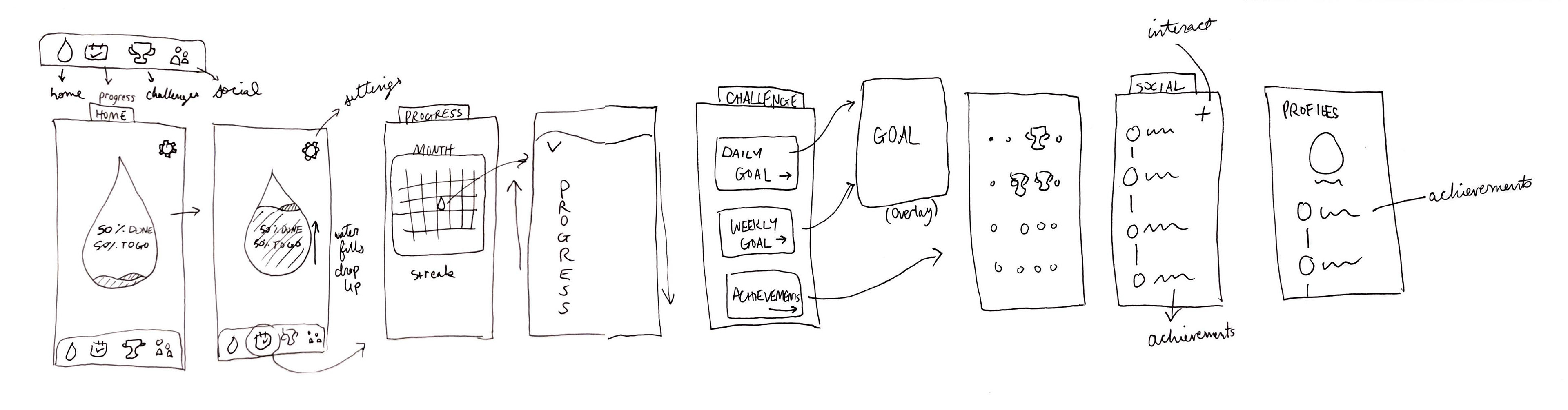
Sketches
These were the first initial sketches I had for the DRNK app. At this step, I swapped the Information Page for a Social Page in order to better align with the goals I created in the beginning. I tried to only flesh out the key features in order to keep the main function of each page clear and concise.
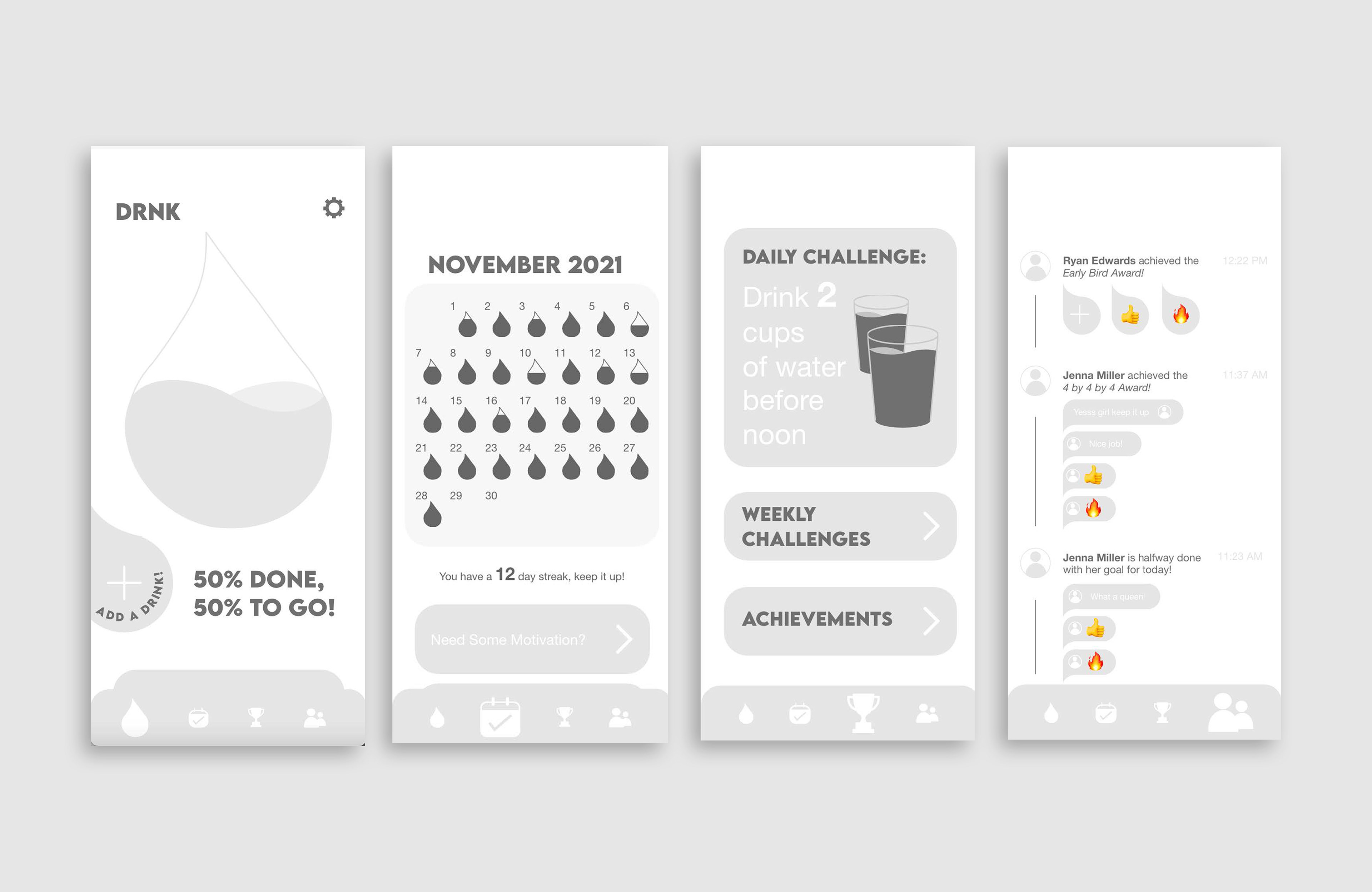
Wireframes
Wireframes of the main four pages were created after the initial sketches were drawn in order to work out this flat, illustrational style I had in mind.
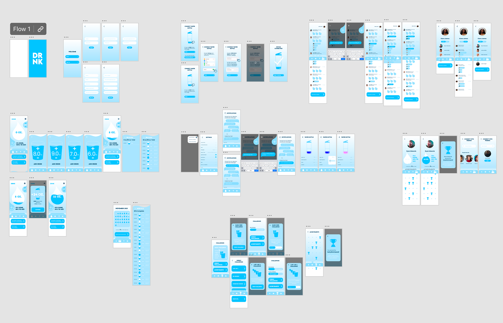
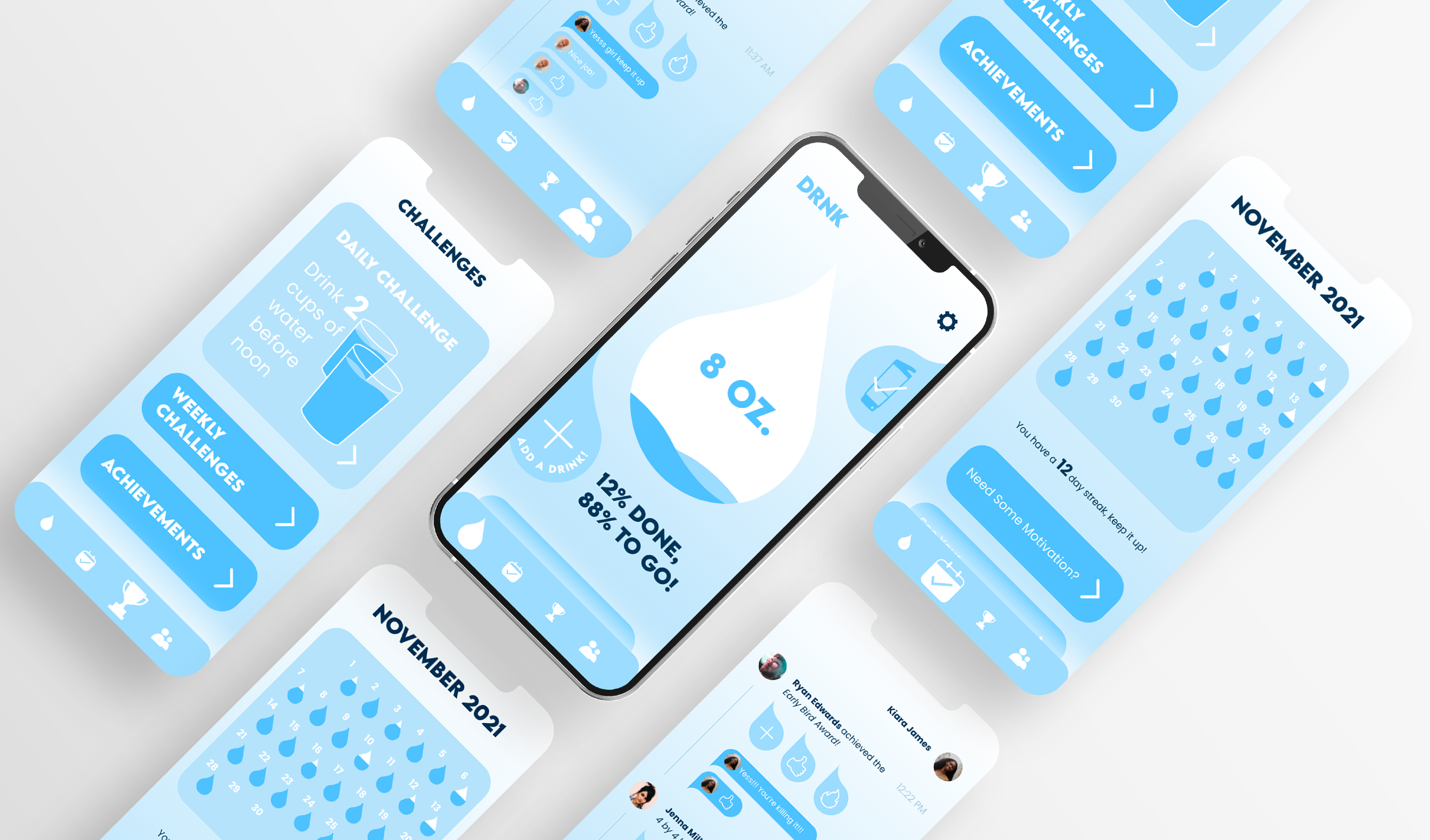
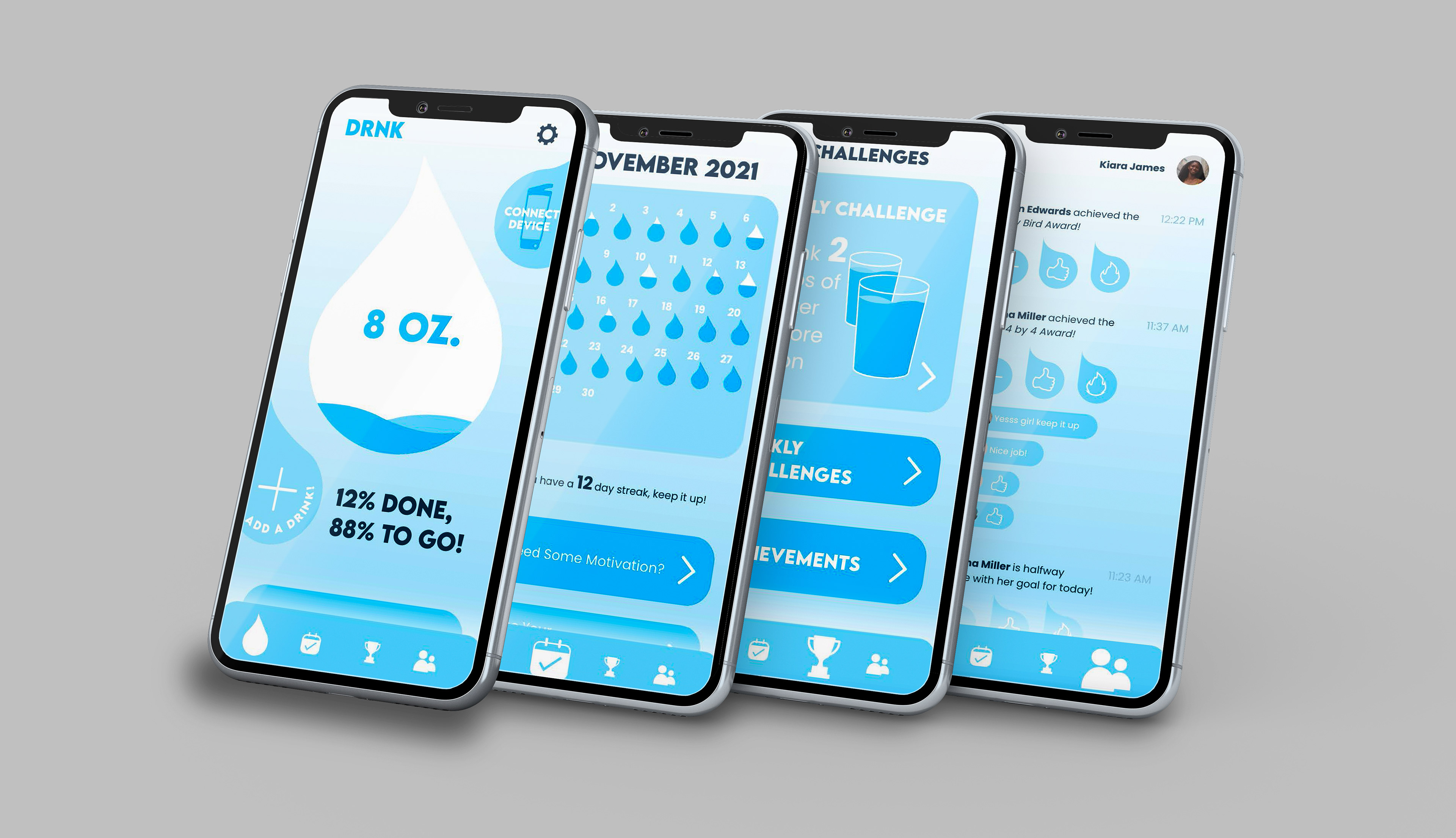
App Design
After wireframes were completed, it was time to jump into the app prototype. Pages upon pages were designed using Adobe XD to get animations running smoothly.
Outcomes & Final Deliverables